
At first glance, the choice and use of colors might seem to be based on personal or even user preferences.
However, there is much more to it than just selecting a simple color palette for your product. There are various factors to consider, including psychological, accessibility, and, of course, user experience issues.
Therefore, throughout this article, we'll show you some theories and how you can use colors in UI to improve your projects and your user experience. Sounds good? Let's get started!
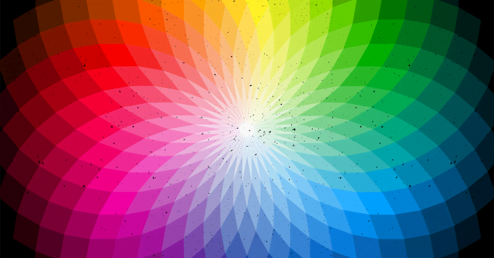
The Importance of Colors in UI
Colors have a significant impact on interfaces and UI projects. A good color palette and scheme can often transform a design from "good" to "great."
Likewise, a poor color choice can be responsible for making a design bad.
However, in addition to the aesthetic factor, which is the most obvious, there are other issues that make the use of colors in UI so important.
Impact of Colors on Brand and Product Personality

Did you know that colors can reflect a brand or product's personality? Choosing the right color palette can effectively convey the message and purpose of your brand or product.
It's like a secret code that speaks to your user's emotions and can influence their decision to use your product.
That's why choosing your colors wisely and sticking to them throughout your design process is essential.
This way, you can create a consistent and coherent identity that reflects your brand's personality.
So, remember to consider the psychological appeal of colors and choose a palette that truly speaks to your brand's identity from the beginning of your project!
Reading tip: Emotional Design: Adding Value To Your Products
Improving User Experience
Colors are not only limited to conveying the message and values of a brand but are also great allies of UX Design.
A well-defined color scheme can aid in the readability of an interface, highlight calls to action, and stimulate interactions in a less intrusive manner.
In this way, using colors correctly is not just a matter of marketing but also of design.
Impact on User Purchase Decision
Studies have shown that the visual aspect of a product or interface significantly influences users' purchasing decisions.
Therefore, choosing your product's color palette carefully is also about considering how they impact your customers' buying decisions.
Selecting the right colors can enhance the user experience and increase the chances of a purchase.
Connection with the user and their culture

Colors carry different meanings and interpretations across various cultures and regions. As a result, using them appropriately can strengthen the brand's connection with its users.
On the flip side, choosing colors that are perceived negatively in some cultures can rapidly decrease the impact of your interface.
Hence, comprehending the audience and persona aids in determining the most suitable color scheme for your product, brand, and interface.
Reading tip: How To Create Valuable User Personas That Will Actually Matter?
Color Psychology
Psychology plays a significant role in various UX and UI design aspects, including color choice.
Although we may not always notice it, colors can profoundly impact our emotions and behaviors, influencing our decisions and reactions.
In fact, our preference or aversion to a specific color can go beyond mere personal taste, as each color carries its own symbolism and conveys a unique message to the user.
The table below provides some examples:

Therefore, choosing the colors that will make up your brand and, consequently, your entire product interface should be done with great care.
You must keep in mind the message you want to convey, assigning colors that align with the values and goals of your product and brand.
It's also worth noting that color preferences between women and men tend to differ slightly. Being aware of these nuances can help you make more informed decisions when it comes to color selection.

The charts above show that blue is the predominant color preference for both genders.
Additionally, women tend to favor the color purple more than men.
Therefore, it is essential for UX designers to understand the impact of colors on people and use them accordingly to provide the best experience for users.
Color Theory
Various color combinations can be used in UX/UI design projects. So how can you choose the ones that will compose your interface?
One of the tools that can help you with this decision is the Color Wheel.
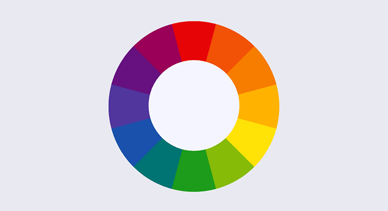
The Color Wheel is made up of 12 colors, which are:
- 3 primaries: blue, red, and yellow;
- 3 secondaries: orange, green, and purple;
- 6 tertiaries: red-purple, red-orange, yellow-orange, yellow-green, blue-green, and blue-purple.
Once you've got the basics of color theory down, it's time to think about how to combine them in the best way possible.
That's where color schemes come in! When choosing a color scheme, there are a few factors to consider, such as shadows and tones, brightness, and contrast.

Remember to consider factors like shades and tones, brightness, and contrast to create a color scheme that really pops.
RGB and CMYK systems
From the primary colors, we obtain 2 main color systems: RGB and CMYK.
RBG
The RGB system consists of a model based on the colors Red, Green, and Blue and is used mainly where there are sources of light, such as televisions, monitors, and mobile devices.
That is, in the digital world, the color system used is RGB. Thus, the different proportions of RGB lights that penetrate our eyes make our brain interpret the different color combinations.
If we look more deeply, we realize that the colors used in the RGB system are different from the concept of primary colors in color theory – Red-Blue-Yellow versus Red-Green-Blue.
This happens because the primary colors of the color wheel do not scientifically reflect the true range of colors.
However, this does not mean that the primary colors of the color wheel are no longer used. They are still very common, especially in paintings and branches of the visual arts.
CMKY
Unlike the RGB system, the CMYK system uses the absorption of color wavelengths and the reflection of light from pigments.
For this reason, the CMYK system is widely used for print media and, in a way, more accurately reflects the real world.
The colors that are part of this system are Cyan, Magenta, Black, and Yellow.
Thus, when there is a painting in yellow, it means that this pigment absorbed the blue color and reflected the red and green colors, causing our eyes to see the color combination that results in yellow.
Shadows and tones

Shadows are used to enhance the UI elements of your interface. Thus, shadows are details that allow the user to have a more refined perception of what is what within the interface.
In addition to shadows, light and darker tones can be achieved by adding more white or gray to the color, respectively.
Reading tip: Gestalt Principles: How To Apply Them In Your UX/UI Design Projects
Brightness

Less brightness provides more variants of dark colors, and more brightness provides more variants of light colors.
To create more or less brightness, you can use saturation.
Contrast

Contrast is an easy way to bring emotions to the user. In general, high contrast occurs when colors from opposite sides of the color wheel are used.
Consequently, low contrast occurs when colors close to the color wheel are used. In this sense, high contrast brings more concentration and focus to the user.
Think about the contrast between black and white, for example. On the other hand, low contrast brings a more pleasant and comfortable feeling to the user.
Hue, Value and Saturation
In addition to the color wheel, there are three other basic concepts that every designer needs to understand about colors in UI.
Hue
Hue is the natural state of a color. For example, green, yellow, or blue. There are no variations of light or dark shades.
In this sense, you can consider that all colors on the color wheel are hue, as they do not have any variation of tone.
Value
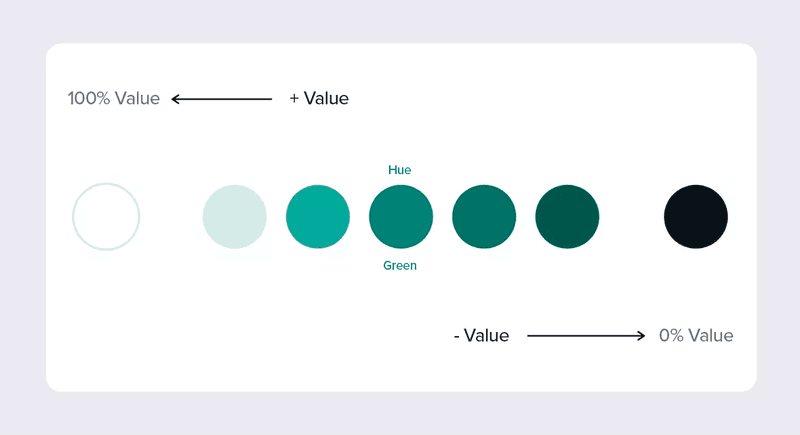
Value is the amount of light that colors have. Therefore, adding or removing light provides various shades for the same color.
Thus, it is possible to provide the sensation of surface and bring more perception of naturalness to the interface.
In UI, using more or less value allows you to increase or decrease the contrast of a color.
Saturation

The saturation refers to the intensity of colors. The higher the saturation, the more vibrant the color appears.
Conversely, the less saturation, the more "dull" the color tends to be. However, it is important to use saturation responsibly.
In the real world, we have a limitation of saturation, which does not apply in the digital world.
Therefore, the use of saturation in printed materials differs from digital materials, and that is why the color system used is different — CMYK for print and RGB for digital.
Reading tip: Does UX Design Limit Creativity?
The color scheme in UI Design
The color scheme in UI Design deals with the use of different colors within an interface.
In this sense, UX/UI design uses color to bring emotion to the user, indicate the interactions they should make, and make the interface aesthetically more pleasing for navigation.
Therefore, it is important to understand some concepts related to the hierarchy of colors that exist within an interface.
Primary and secondary colors
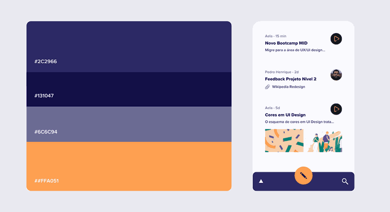
These are the basic colors of an interface. They are usually connected to the brand colors and are used more frequently in the interface.
As a rule, do not use too many primary colors; three should be the maximum number.
Highlight colors
Highlight colors are used to enhance certain UI elements in your interface.
Some examples include progress bars and menus, buttons, important links, and necessary interactions.
Generally, highlight colors have more saturation and brightness, which makes them more visible to the user. Thus, they indicate interactions and encourage the user to take desired actions in the interface.
Neutral colors
Neutral colors are meant to support the interface. They are usually used for backgrounds and text.
Semantic colors
Semantic colors have an intrinsic meaning for the user and provide information about care, success, and error.
Often, colors to indicate this type of information are Red, Yellow, and Green – remember traffic lights?
In this sense, semantic colors can be used in any interface of any product because they usually have the same meaning for the user.
Reading tip: Cognitive Bias: How to be Unbiased in Your UX Projects?
How to use colors in UI
As seen, colors in UI have a relevant role for the user experience. Therefore, it is important to know how to use them in the best way possible.
With that in mind, we have gathered some tips to help you work better with colors in your UX/UI projects.
Shadows are never black and light is never white

A common mistake is to think that the shadows of elements are black and opaque and the lights are white and opaque.
However, the shadows are the same color as the object, but with less value and darker tones.
For example, the shadow of a red apple is not black, but a dark shade of red. Similarly, the light on an object – meaning the reflection of light – will never be white, but rather its color with more value and lighter tones.
Color and typography
Typography is also an essential element within an interface. But in addition to thinking about the fonts, it is important to consider their colors too.
At first, the tendency is to use the color black for regular texts that do not indicate a link or CTA for the user. After all, some say that black is always a good option, besides conveying seriousness and neutrality in texts.
There is no problem with that. However, you can experiment with varying text colors to give your interface a different look. See the example below:

Although the difference is subtle, using colors that are more aligned with the brand identity can be a good way to make your design stand out.
Reading tip: Typography in UI: How To Enhance User Experience
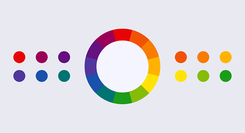
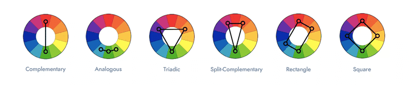
Use color schemes and combinations
It's important to note that not all colors are compatible with each other. Some combinations blend colors in a pleasant way, while others do not.
That's why it's crucial to invest time at the beginning of a project to identify patterns and color schemes that will bring better results for you.
There are several color schemes that you can use within the color wheel, with the most common being:
- Analogous: using 3 colors located close to each other on the color wheel; Monochromatic: color and tone scheme created from a single hue;
- Complementary: a scheme that combines colors from opposite sides of the color wheel.
Don't forget about the accessibility of colors
The system should provide the best experience for different groups of people, including individuals who have some visual impairment. To achieve this, keep in mind some basic rules:
- The text must be legible on any background, be it lighter, white, or colorful;
- Work well with the contrast between interface elements;
- Text is the most important element in the interface, even compared to the colors used around it.
To help check the accessibility of your system, you can use two tools: Contrastchecker and Stark.
Contrastchecker
Contrastchecker was created to verify compliance and test color contrast according to the Web Content Accessibility Guidelines rules.
To use the tool, simply enter the foreground and background colors that will be used in your interface. You will then receive the contrast test result, indicating whether your choice has passed or not.
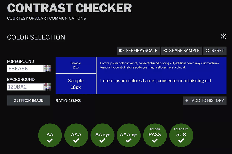
Additionally, you can check how your color choices will appear in grayscale, simulating how color-blind individuals would see them.
This tool can be really helpful in your projects; the best part is that it is free.
Stark
Stark is a great tool that takes accessibility verification to the next level. It offers more features than Contrastchecker, including contrast checking and valuable suggestions that make decision-making easier so you don't have to conduct so many tests.
Stark also provides a detailed color blindness verification, where you can simulate various types of color blindness to ensure your interface is accessible to all users.
Although Stark is a paid tool, it offers a free basic plan.
Work with a limited number of colors
It's important to keep in mind that the more colors you use in your interface, the more challenging it will be to maintain balance.
That's why working with a limited number of colors in your projects is generally recommended.
For different platforms, like mobile applications, you can create monochromatic schemes that use variations of a single hue.
By restricting your range of options and working with fewer colors, your interface will have a greater sense of stability, which is crucial for a positive user experience.
So remember, when it comes to colors in your interface, less is often more!
The golden rule: 60:30:10

The 60:30:10 rule determines a balanced proportion for successfully combining the colors in your interface.
Conceptually, 60% of the interface space should contain your primary color, 30% your secondary color, and 10% the remaining color.
This rule brings harmony to your scheme and avoids your interface becoming unbalanced, even with few colors.
Reading tip: Laws of UX: The Basic Principles of UX Design
Contrast is one of your best friends
Contrast is responsible for bringing individuality to each UI element on your screen. Therefore, if you want to make a component more visible, use contrast to make it more noticeable.
While contrast can be a helpful tool, it's important to use it in moderation and with caution.
Overusing high contrasts can actually make UI elements or text difficult to read and even illegible.
Nature is your best source of inspiration

Take time off to observe nature whenever you feel stuck or lack inspiration for using colors in a project.
The colors in nature are perfectly balanced and have various tones, shadows, and lights that can stimulate you and bring different ideas.


.svg)