Do you know what a Landing Page is? Among so much information you need to pass to the user, sometimes you need to lead him to a specific action that allows the company to monitor the result of this action. That's where Landing Pages come in.
A Landing Page (LP) is a standalone page created to do just that. This article will explain everything about Landing Page and what you can do to optimize yours.
Keep reading to learn how to increase your conversion rate!
What is a Landing Page?

A Landing Page (LP) is where users arrive after clicking on a link – through emails, Google, or any other digital medium.
Also, a Landing Page should be a stand-alone page created specifically for a marketing campaign. In other words, it is not part of your website.
Once users arrive at your LP, they are encouraged to take an action, such as filling out a registration form or buying your products.
Landing Page Effectiveness
For a Landing Page to be effective, it should encourage visitors to perform only one action, thus increasing the chances of conversion. If the user performs the desired action, the page has succeeded in converting them.
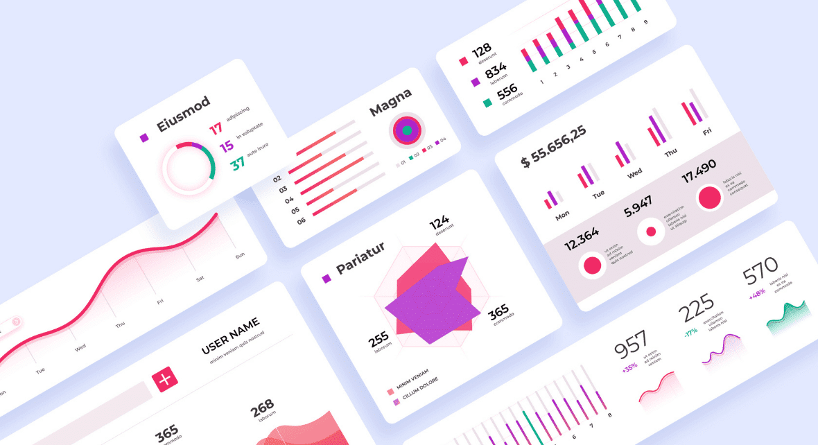
Another crucial factor for conversion is constant optimization through testing. Don't guess what your visitors prefer; use tools like heat maps and eye-tracking to evaluate the visitors' behavior on your page.
The insights generated from these tools help you improve your design and CTA and increase your results.
For an LP to translate your brand's identity, it is essential to clearly understand what the brand represents and its value proposition.
To summarize:
- Your landing page should have one focus: sell a product or capture leads;
- Conducting A/B tests to see what works better with your users;
- Continuously improve the design and copy according to tests results;
- Clear definition of brand identity and value proposition.
Reading tip: How To Create A Style Guide
Call-to-action
Landing Pages are designed with a single focus or goal, called Call-to-action (CTA).
This focus makes a Landing Page the best option to increase the conversion rates of your marketing campaigns and decrease the cost of selling or acquiring a lead.
The main success metric of a Call-to-action is the CTR (Click-through Rate). The CTR must answer the following question: Out of so many people who saw the ad, how many clicked?
This way, you can measure the efficiency of a campaign.
Reading tip: Product Discovery: Identifying Problems And Defining Solutions
Types of Landing Pages

There are 2 types of Landing Pages based on the company's main goal:
- Lead generation
- Clickable action
1) Lead generation
If the company's purpose is to generate leads, the Landing Page will be used to gain contacts from potential customers.
Thus, the goal of the page is to capture user data, such as name, email address, or other information that may be relevant to the company, according to their needs.
The data collected will allow the company to establish contact with the target audience and consequently move forward in the sales funnel.
Now, think with me: try to remember the last time you left your contact/email on a website and another time when you preferred not to share your data. What made you do that on both occasions?
Usually, when a website asks us for some information, our instinct is to ignore it, give up, or close the page.
Therefore, in addition to a form, the page for capturing leads should clarify what the visitor will receive in return for submitting his data.
So, to ensure that visitors leave their data, offer something that presents value to them.
It can be a manual, a spreadsheet template, or a guide on a particular subject.
2) Clickable action
The highlight of this type of Landing Page is the CTA buttons. This way, when users click on the CTA, they will be redirected to a page where they can complete the action defined according to your company's strategy.
A button that says "Schedule your demo" could take visitors to a scheduling page, while "Buy now" would redirect to a checkout page and so on.
Clickable action landing pages are very useful in e-commerce funnels. They can be used to describe a product or offer details that delight visitors until they are closer to making a purchase decision.
Reading tip: Tree Testing: How Easily Can Users Find The Information They Need?
Less is more
The Landing Page is where the conversion (such as a purchase, signup, or registration) will take place, and it will appear to the user after they click on an ad, email, or elsewhere on the web.
The Landing Page is already qualifying the lead because the user will only click on the ad if they are, in fact, interested.
Why your Homepage should not be the Landing Page
While a homepage contains numerous distractions for visitors, the landing page has only one focus.
Think about it: your homepage showcases your brand, lets your potential customers explore your products, and provides additional information about your company and its values.
It is a place where visitors have several options—they can apply for a job, read company news, and ask any questions about a product or service. But users will not necessarily make a purchase, which does not give you results. Not convinced yet?
As studies prove, too many different CTAs can create confusion in the user—and indecision will always drive them away from the purchase decision. This demonstrates a phenomenon known as analysis paralysis, where too many options result in no decision at all.
That is why marketers always use a specific Landing Page as the destination for their traffic. Having fewer links on your Landing Page increases conversions, as too many links can disperse the user's attention and lead them away from your call-to-action.
Reading tip: KPIs in UX Design: Why Do We Need Them?
Tips for building an effective Landing Page

When it comes to user experience, even a small change can become a big advantage for a company.
Landing pages need to provide the information users need to make a decision and clearly show the path forward.
We have compiled below some practices to increase the conversion rates of your Landing Page and bring you up to date with the best practices:
1) Don't let users get lost
Clearly state everything the user needs to know to reach a decision. The user experience of your Landing Page should be simple and intuitive and provide answers to any questions the visitor may have.
To ensure that your users are not confused by your site's information architecture, you must understand how they think.
Information architecture is how you organize and structure the content of a website. There are two great methods for improving information architecture, thereby enhancing the user experience.
- Card sorting: is a research method that allows you to understand users' mental models and how they interpret and categorize the information on your website. This helps you to figure out how to group and label your content in a way that makes sense to your users and makes navigation easier.
- Tree testing: is a tool that tells how easily users can find information on your site. It is a popular method for testing the effectiveness and intuitiveness of information architecture. Basically, it is reverse card sorting, used to verify the results obtained with card sorting.
2) The offer should be clear
Visitors must be able to explain – without difficulty – the product or service that the company is advertising.
Therefore, the value proposition must be clearly communicated: users must quickly find out what the page is about, how it can be useful, how the product or service works, and how to navigate to the next action.
All the information needed to make a decision should be addressed. This can include questions or hesitations about pricing, shipping, return policy information, or warranties.
3) Don't add too much text
If the Landing Page is full of text, users will not be able to find what they are looking for quickly. If that happens, the likelihood is that they will give up.
Only 16% of users read every word, while 79% scan the text. Therefore, a good practice is to make a paragraph no longer than 3-4 lines with descriptive subheadings every two sections.
The Nielsen Norman Group found that concise, scannable, objective copywriting leads to a 124% increase in usability.
So remember to keep it simple and to the point.
4) Keep the form brief
You will need to create a form if the campaign aims to generate leads. In this case, ask only for necessary information so as not to scare visitors away.
Other essential factors include confirmation messages, character validation errors, intuitive labels, and micro-copy.

5) Invest in the title
The title is the first thing the visitor reads when arriving at the Landing Page and is your opportunity to captivate and delight. It should be clear, relevant, and touch on the main benefit of your offer.
Don't forget that the title should also match the expectation of your target audience; if they arrive at your Landing Page through an ad, ensure the message is aligned with it.
6) Don't forget the subtitle
Use headings to communicate more specific information. They make it easier to read scannable and give you more space to complement the main title.
7) Design
We process visuals much faster than content. This means that your Landing Page design is critical to your reputation. So it should look professional and trustworthy, not spammy.
The most highlighted element on your page should be the most important. Therefore, pay attention to the composition of your page: elements' size, positioning, and colors.
Remember: the offer and the call-to-action should be the top priority in your visual hierarchy.
If you have content below the fold, leave breadcrumbs! While almost everyone is used to continuing scrolling down the page, we want to make sure to motivate them to keep scrolling.

8) Benefits beat features
Features count, but benefits drive your offering and sell. So focus on the benefit, not the features.
Show what your customer will gain from the product or service. Instead of advertising about the specific properties of a detergent, say: "Your glass without stains."
So features (technical specifications, details, materials, or composition) are important for context and decision making but try to translate them into benefits.
Educate your target audience on both, but find a balance based on what will resonate best with your users.
9) Use techniques to increase conversion
Incentives motivate people to act now, not leave it for later. Make your offer seem irresistible by using some persuasion technique that is relevant to your value proposition.
- Urgency: Used to motivate people to act now. Ex: "Limited time offer" or "5 days left to participate!"
- Trust: testimonials, ratings and reviews, case studies, safety icons, statistics, and data.
- Scarcity: Similar to urgency, but refers to a quantity rather than time. People are attracted to things that seem exclusive or unique. Ex: "Latest pieces" or "Booked 25 times in the last 3 hours!"
- Authority: Numbers make a difference, which is why so many companies use doctors, celebrities, or famous chefs to endorse their products. Ex: "9 out of 10 dentists recommend…"
- Giveaways: People are more inclined to buy if you give them a giveaway. Ex: Free shipping, free gifts, coupons/discounts, special offers, free cancellation.
10) Improve the loading speed of the page
Try to leave your Landing Page loading between 0-2 seconds, or at most 2-4 seconds.
According to research, site conversion rates drop by an average of 4.42% for each additional second of loading time (between 0 and 5 seconds)
Ideally, you should compress your images before uploading them to the page. You can also use Google's Pagespeed Insights tool, which offers tips on improving your site's loading time; you only need to enter your URL.
11) Responsiveness
It might seem obvious, but it is good to remember that your website needs to be adaptable to any device. So test it on multiple screens and browsers.
That way, regardless of the screen size, you ensure that your visitors will have pleasant navigation.
12) Call-to-action
Pay close attention to your Call-to-action. If users are left unsure of what to do next, they will likely leave the site without performing the desired action.
Check out the best practices for a CTA that converts:
- Prominence: make sure the CTA is prominent and a good size.
- White space: the button should have enough white space and visual contrast around them to make them stand out on the page. Relevant icons can also help draw attention to the Call-to-action.
- The microcopy on your button should be attractive: as a good rule of thumb, ideally, the button text should complement the phrase, "I want…". you can also do keyword research, user testing, and surveys to identify trigger words to include in your CTA.
- Minimize worries: alleviate anxiety and worry with prompts like "Cancel anytime" or "Up to 30 days no charge". Phrases like '14-day free trial' can also minimize fears, encouraging visitors to click on the CTA without fear.
- Use first-person verbs: First-person sentences emphasize that the user must take action, such as "Start my free trial."
- Include icons: You can include icons in CTA buttons to clarify the action. People are more likely to click on buttons with arrows, for example.