
Color management is essential to reproduce the colors the way you imagined on different types of devices and media.
One of the most frustrating things that can happen to your designs is not being able to control their outcome and seeing inconsistency across screens or printings.
The subject is not the simplest and requires a lot of practice and experience. So, have a little patience to go forward and respect your learning process!
What is color?

Before we delve into color management, let’s revisit some important definitions that, perhaps, are not so clear to everyone. The idea is not to go into the details of physics, but rather to cover the subject sufficiently so that the rest of the text makes more sense to you.
That said, we can start by talking about our eyes. Our retina has two kinds of cells that detect light; rods and cones. Rods are sensitive to low or dim light, and cones are activated in brighter environments.
The cones are divided into three types, differing in the photopigment each contains, and therefore, they each respond to different wavelengths:
- long (reds);
- medium (greens);
- short (blues).
When these wavelengths stimulate our eye cells, the brain receives signals and interprets them in a unique way: the colors we see.
So, colors are the perceptions of light at different wavelengths captured by our eyes.
However, we do not only see the three colors of the wavelengths described above. Instead, our brain can mix signals and perceptions so that we can identify the other colors on the spectrum, such as yellow, orange, purple, etc.
Why do we need to know about color?
Colors reflect the world we live in and are part of our routine. We use them everywhere, from creating a visual identity or brand guidelines to beautiful art pieces.
So knowing about colors means understanding how to make the most of them for your projects and not underestimate their power.
In addition, you’ll learn how to manage them so that different media and devices can accurately reflect the colors you planned.
Reading tip: Visual Hierarchy: How To Prioritize and Highlight Information
Color Management: a glossary for starters
Before jumping to color management, there are a few other essential color concepts to address:
- Modes;
- Space;
- Gamut;
- Depth.
Color Modes

As we saw above, our eyes are responsible for capturing light waves so that our brain transforms these signals into colors.
The problem is that computers, programs, and paper don’t have this automatic system that our bodies do naturally. It seems like an obvious — and silly — statement, but if you look at it from this perspective, it’s easier to understand what color modes are.
The solution was to create models and systems based on mathematical values that computers and other devices could understand to best reproduce the colors our eyes see.
That way, the most common color models are:
- RGB:
- CMYK:
- HSB:
- Lab:
RGB
The RGB model is based on the three wavelengths that our eyes perceive: Red, Green, and Blue. This model, sometimes described as an additive color model, describes how colored light combines to create other colors.
This model is used in many devices that emit light and change colors like monitors, TVs, and LEDs. Hence, color management in the digital world is primarily based on the RGB model.
CMYK

CMYK color model is used in color printing and, unlike RGB, is not based on light but on pigments.
If you ever had to buy toner or ink cartridges for your printer, you’re probably already familiar with Cyan, Magenta, Yellow, and Key (black), which are the base colors of the CMYK model.
HSB

The HSB model represents colors differently and is determined by hue, saturation, and brightness.
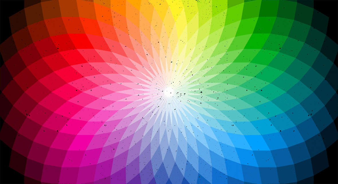
- Hue: is the color in its natural state and can be any of the colors inside the color wheel. Being in a natural state means that the color does not have light or dark tones variations.
- Saturation: corresponds to the intensity of colors; the more saturation, the richer a color gets. Saturation is measured as a number between 0 and 100. Where 100 will be the richest possible color for that hue and 0 the gray version of that color.
- Brightness: is responsible for creating lighter and darker tones variations and is also measured as a number or percentage between 0-100. The closer to zero, the darker a color gets.

Lab
The Lab model is the closest to the exact color and is calculated using mathematical formulas. Because of this, the colors represented by this model are consistent across all types of media and devices.
The Lab is based on the theory of opposite colors and works on the premise that two colors cannot be, at the same time, green and red or yellow and blue.
The Lab model is widely used in color management software, and the acronym stands for:
- L = luminosity;
- a = red/green chromatic coordinate;
- b = yellow/blue chromatic coordinate.
Color Space
A color space is a specific range of possible colors and luminance values; it serves as a guide for using the color modes.
Its main objective, practically speaking, is to describe the capabilities of a device to reproduce color information.
But we can only define a color space in reference to another color space.
Thankfully, there’s a standardized reference – the CIE 1931 color space, that gives us the ability to describe all other color spaces.
The CIE 1931 is a mathematical system to quantify all the colors humans can perceive; it tell us how to numerically specify a measured color, so we can accurately reproduce it.

Color Gamut (Gama de Cores)
Color Gamut corresponds to the range of colors within a Color Space that can be reproduced on various devices, such as monitors and cell phones.
When we can not express a specific color within a particular color model, those colors are said to be out of gamut.
Color Depth
Color Depth measures the amount of information available to represent color and it is measured in bits; the more bits, the greater the number of colors a device can represent.
Generally speaking, the higher the number of bits, the higher the image quality on a given device.
So what is Color Management?
Now that we have covered essential concepts regarding images and colors, we can better explain color management.
Color management ensures that colors remain consistent — and as intended by the designer — throughout the editing workflow, taking into account various hardware, software, and devices such as tablets, phones, and monitors.
In other words, in order to manage colors, it is important to understand which models, spaces, gamma, and depth of color should be used so that the final result is loyal to its origin. This will be indispensable to making images suffer the least possible from all the manipulation involved in a design process.
In this sense, color management must include three basic components:
- An independent color space;
- ICC profiles for each device or tool used in the process;
- Color Matching Module (CMM).
Independent color space for Color Management
When we talk about independent color space, we refer to not using a model or color gamut that makes you dependent on a single type of device.
Avoid using such specific parameters that will only be accurate on iPhones, for example.
The idea of color management is precisely to cover the most diverse devices and media so that the art – physical, digital, photo, or video – is consistent and faithful to what the designers have developed.
ICC profile
If the purpose of color management is to keep colors consistent throughout a design process and across different devices, how do we know which settings to use?
To solve this problem, the International Color Consortium was created. The ICC is like an instruction manual, where people can check how to best represent colors in a given device.
ICC Profiles describe the color attributes of a specific device or viewing requirement by defining a mapping between the device source or target color space and a profile connection space (PCS).
When we receive an image, for example, and open it on Photoshop, this file probably has an ICC profile attached to it that must be followed.
Notice that every device that captures or displays color can be profiled.
Color Matching Module (CMM)
CMM is software that mathematically adjusts the perceived color values on different devices. Basically, the Color Management Module is the master key of color management and is what performs all the calculations to translate one color space into another.
With the CMM, you can now deal with a color that otherwise would not be correctly reproduced on a different device; it helps make the necessary adjustments so that the colors in your projects remain constant.
After characterizing the color response of a particular device, color-managed software then uses these standardized profiles to translate color from one device to another.
The most common software for this is:
- ColorSync;
- Adobe CMM;
- Little CMS;
- ArgyllCMS.
Photoshop Color Management
Ok, we presented some of the concepts involved in color management. What now? How can you put this knowledge into practice and better manage the colors of your projects?
The following section will show you how to start managing colors using Photoshop.
It is worth remembering that this subject is complex, in a way, and it takes some experience to master it. Training and experimentation are part of the process and what we are going to show you here are the basics to get started.
Photoshop Color settings
For most color-managed workflows, it is best to use a preset color setting that has been tested by Adobe. Changing specific options is recommended only if you are knowledgeable about color management and very confident about the changes you make.
In the color settings dialog box, it will appear with the following information:

The main factors that will influence color management and that you need to pay attention to are:
- Working spaces;
- Color Management Policy Options;
- Conversion Options;
- Advanced Controls.
1) Working spaces

The working spaces correspond to the color models we saw at the beginning of this article and how colors will be treated in your Photoshop files. To display these options in Photoshop go to Edit > Color Settings.
There are the four types of working spaces:
- RGB;
- CMYK;
- Gray;
- SPOT.
RGB and CMYK are the models that we have already explained. Remember that RGB is used for digital projects, while CMYK is used for printing media.
The Gray and SPOT models are also used for printed projects and allow you to edit the tonal gain (dot gain) of black (Gray) or colored (Spot) dots.
Color management policy options

A color management policy determines how the application handles color data when you open a document or import an image.
You can choose different policies for RGB and CMYK images, and you can specify when you want warning messages to appear.
To open this dialog box, go to Edit > Color Settings.
Choose from the following options:
- Preserve Embedded Profiles;
- Convert To Working Space;
- Off.
Usually, the best option is to leave RGB, CMYK, and Gray to preserve embedded profiles. They specify a policy to follow when you bring colors into the current working space —either by opening a file or importing an image.
The Preserve Embedded Profiles option preserves embedded color profiles when opening files. This is the recommended option for most workflows because it provides consistent color management.
The Off option is not recommended if you’re a new Photoshop user because it ignores embedded color profiles and does not assign the working space profile to new documents. Select this option only if you want to discard any color metadata provided by the original document creator.
Finally, the Convert to Desktop option converts colors to the current working space profile when opening files and importing images. Use this option if you want to force all colors to use a single profile (the current working space profile).
3) Conversion options

The Conversion Options correspond to the Color Matching Module, which we saw earlier in this article. Use the Conversion Options to edit the way you convert files from one color space to another.
Note that changing these options is only recommended if you are confident about the changes you make, so if you’re not knowledgeable about color management we advise you not to change it.
To display conversion options, choose Edit > Color Settings, and select More Options.
Engine Specifies the Color Management Module (CMM) used to map the gamut of one color space to the gamut of another. For most users, the default Adobe (ACE) engine fulfills all conversion needs.
For conversion, you can choose between four types:
- Intent: it specifies the rendering intent used to translate one color space to another; differences between rendering intents are apparent only when you print a document or convert it to a different working space.
- Black Point Compensation: it ensures that shadow details in the images are preserved. Select this option if you plan to use black point compensation when printing — which is usually recommended.
- Dither: controls whether to dither colors when converting 8bit-per-channel images between color spaces. When you select this option, Photoshop mixes colors in the destination color space to simulate a missing color that existed in the source space. Although dithering helps to reduce the blocky/banded appearance of an image, it may result in larger file sizes if you compress images for web use.
- Compensate For Scene-Rendered Profiles: compares video contrast when converting from scene to output profiles; this option reflects default color management in After Effects.
4) Advanced controls
In Photoshop you can see advanced controls for managing color by going to Edit > Color Settings and selecting More Options.

Overall, the advanced controls let you control saturation and RGB colors. Keeping these controls in default is the best option:
- “Desaturate monitor colors” should be left unchecked as it is deliberately causing your monitor to deviate from an accurate profile.
- “Blend RGB Colors Using Gamma” should be left unchecked. Setting this to 1 actually creates better blends of color.
- “Blend Text Colors Using Gamma” should be left checked and set to the default 1.45.
Final considerations: exporting files
When you export or save files in Photoshop, there are some color management considerations.
The best export option is TIFF if you don’t need the edit the file later in other programs that require layers (like Premiere or After Effects),
But, if you do need to edit the layers later, the best export option will be PSD.
Use PNG or JPG formats if you need secure, non-editable files.
Reading tip: Emotional Design: Adding Value To Your Products
Color Management is not the same as Image Treatment
Last but not least, it is essential to clarify that color management and image treatment are two different things.
Color management happens throughout the entire creation and development process, from photography — in the case of an image — to exporting a file.
Image processing is part of a post-production step within the creation process.
Therefore, color management is also present in the image processing step, but it is not limited to this step alone.