Many UX designers believe that if their job is done right, Visual Design is not that important. The truth is that UX and UI design contribute to each other and should always work together.
In this article, we will discuss the symbiotic relationship between UX and UI design and present 6 fundamental tips for designers to develop interfaces that are both functional and visually appealing.
The Halo and Horn Effect
According to research, aesthetics can play a major role in influencing users; it has such a significant impact that they might believe something works well because it looks good.
This is known as the Halo effect, a cognitive bias that positively affects how people judge something or someone based on a previous good experience.
Likewise, users might think less of a product if it's not aesthetically pleasing, or they may assume a product won't work correctly because of a typo. This is known as the Horn effect; it allows a disliked trait or aspect of a product to negatively influence their judgment about the entire product.

Thus, a good Visual Designer must think about both concepts, UI and UX Design, in a balanced way, keeping in mind both aesthetics and functionality. Everything should be tied strategically.
Although Visual Design is sometimes overlooked when we are talking about UX, it plays a crucial role in delivering designs that work.
When it comes to UX, the UI Designer plays a strong and indispensable role in creating functional interfaces. The UI Designer must consider the overall layout of each screen and how all the separate screens fit together to benefit the optimal user experience.
This article was based on a presentation by Product Designer Jon Vieira.
6 visual design tips for creating functional UIs
1) Users want innovation but also familiarity

People tend to get used to routines. Even if innovative products and solutions are appealing, it is not easy to adjust to change. Therefore, suddenly disrupting the familiarity that people are used to can be dangerous.
With that in mind, there are guidelines to avoid creating a new association with a particular tool, increasing cognitive load.
Here, the role of the UI Designer is to be mindful of users' patterns across different products. This way, changes, and innovations follow the same guidelines to maximize usability.
2) Guidelines
Guidelines are a set of rules and best practices that a Designer should follow. A good example is the Material Design guidelines used on Android devices.
These guidelines contain rules and standards in various facets of Design, such as components, navigation, and forms, among others. Each device – Android or IOS, for example – has its own interaction rules, and users are used to these standards.
While some variations are acceptable, designers must know the best practices and guidelines and be aware of the potential implications of breaking these rules.
Of course, there will be situations where specific rules may not be good for you. So while it is important to follow these standards, questioning them is equally important to ensure the rules work for you and not against you.
Reading tip: Design System: How To Create One?
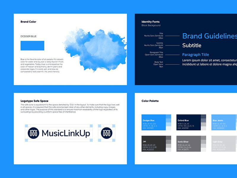
3) Brand identity and Visual Consistency
Another critical aspect of a great user interface is consistency with the brand's visual identity. The Visual Designer often needs to establish several fonts for different screens, one for each point of contact between the user and the brand.
Known as omnichannel experience, this convergence of touchpoints requires the interfaces to have a solid consistency in their visual elements, like colors and typography, but also other aspects like voice and tone.
For the UI Designer, colors and typography are basic elements that must be established at the beginning of a project.
In the case of typography, there are three key elements to which the Visual Designer must always be attentive:
- Font size (avoid, whenever possible, small fonts – especially on mobile);
- Line width;
- Line height.
In addition, it is fundamental that no more than two font types are used in the entire project.
4) Determine less precision for desired actions
Desktop and mobile interactions call for different solutions and user experiences. However, what impacts the difference between these experiences the most is not the screen size but the touch feature.
The touch, that replaces the click effect, becomes even more complex when we consider gestures and pressure (3D touch).
Consider that when people use a cell phone, they might use their thumb or their index finger; this makes the specific touchpoints much more complex. So, to create a functional interface, the UI Designer needs to create large elements.
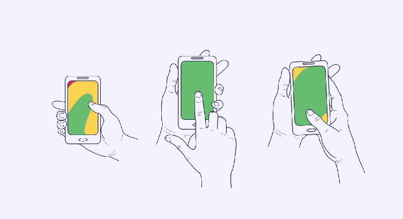

However, when the UI Designer wants to promote a particular action, these elements also need to look large to attract the user's attention and make it easy for them to click on.
By requiring less precision of desired actions, the professional can generate a higher rate of clicks or conversions.
The same can be done for actions that the UI Designer does not want to be performed as often.
This requires a more accurate precision for the user to actually be aware and commit to the action – an example might be deleting their profile from a social network.
However, it is extremely important not to fall into a dark pattern, i.e., hiding elements from users.
Reading tip: Jobs To Be Done To Grow Your Business
5) Don't overload the user; help them find their way
This is a famous saying among UI/UX Design professionals. Your users don't want to waste time thinking of how to perform a certain action; they just want to get it done.
The role of the UI Designer, in this case, is to help the user find the path they are looking for in the fastest and easiest way possible.
On this subject, we recommend reading Steve Krug's book "Don't Make Me Think."

For this reason, several elements of Gestalt are applied to Visual Design. Known for advocating that to understand the parts, it is necessary to understand the whole; the concept presents fundamental principles for better interaction.
These principles allow the user to interact with the interface without effort, for example, colors, points of proximity and continuity, and optical illusions.
Generally, people don't read everything that is exposed in a UI. And since colors can also suggest interactivity, it is interesting that the UI Designer uses the right colors on elements that are, in fact, interactive.
The principle of proximity is created when a visual element (such as an icon or a photograph) is placed next to a word, allowing the user to make the association that the elements are grouped and that they send a message together.
The continuity principle is used when you want the user to have the sensation of infinity, like when they scroll down a page, and the screen goes down.
Ultimately, the UI Designer helps the user as much as possible, effectively signaling all the routes and paths they can take, actions they can perform, and ensuring great navigability through the interface.
6) Animation for the sake of animation is pointless

Animations are very interesting elements to use in UIs, making the UX more effective and interesting. They draw a lot of attention, attracting the user's peripheral vision.
However, it is fundamental that the Visual Designer has a lot of common sense when inserting animations into their work and remember that they always need to have a meaning and a reason for being there.
Using an animation that doesn't convey any message will only make your page heavier and overload users with unnecessary information.
Animations can be inserted to complement written text or to express a feeling, but they should not be repetitive – this does not make a good impression on the user and quickly becomes tiresome.
The importance of a UI Designer
After all these tips and insights, it is clear that Visual Design is not just about looks and aesthetics – research and studies have a lot of importance for the functionality of an interface.
An example is Apple, which conquered the public with an innovative, aesthetic, and functional design.
The UI Designer is responsible for the functionality of the final interface, so it is very important to be able to convey meaning and functionality in the elements used.
This is one of the crucial points that differentiate a UI Designer from a Graphic Designer because personal preferences are put aside, and the focus on experience becomes the primary factor, even if it sacrifices standards and beauty trends.
As it is directly related to the functionality of an interface, the Interface Designer has a fundamental role in the user experience. Through their attention to detail and commitment to the aesthetic quality of the project, the UI Designer can reflect the brand's personality and develop key points for interaction without hindering the user.


.svg)