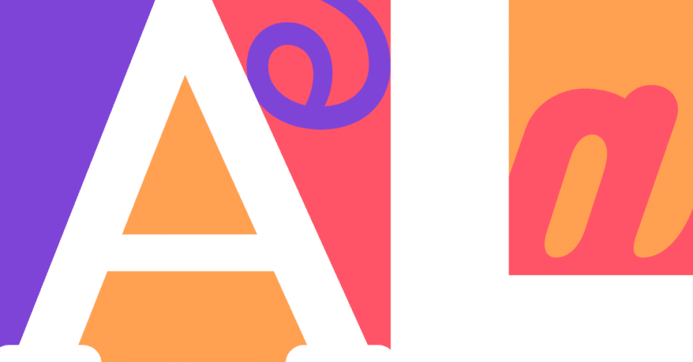
Typography is a great part of our experience with products and interfaces.
Think about it: we communicate through text every day and have the power to choose the best fonts and colors according to what we want to say. And as in every choice in UX Design, before you decide on the best typography, there's a lot of research to be done. Therefore, you should cover these essentials:
- Understand the concept behind the brand;
- Comprehend the goals of the product and the company;
- Know the target audience;
- Be familiar with the style guide and tone of voice.
In this article, we'll show you all the possibilities in typography and how you can use that in your favor to improve the experience of your target audience. After all, it's not just about what you say it, but how you say it.
What is typography?

Typography is the style or appearance of text, and it can refer to the art of working with text – like in the case of Designers.
Matthew Butterick has a commonly used definition: "Typography is the visual component of the written word."
Therefore, typography enables to making language visible and plays a vital role in Design. You should also include a Typography study in your Style Guide.
Typography and Lettering
It's important to distinguish between Typography and Lettering, which are two fields very trendy today, and people tend to confuse them.
Indeed, they both deal with letterforms, but in different ways.
Typography involves working with pre-made letter systems, like typefaces and fonts, to layout and arrange content.
Lettering, however, involves crafting letterforms for single-use and purpose instead of a pre-made letter system.
Why is Typography so important to User Interface?
When we come across a website, a mobile app, or any other digital product, we will see textual content. And even though it's not something we are conscious of, the way the text is presented and organized has the power to significantly influence our experience with the interface.
The choice of colors, sizes, spacing, and fonts utilized has the ability to provide comprehensive product communication – or not. So typography works with all these elements to make the text information as user-friendly as possible.
After all, depending on the product, the user will interact with it several times a day — which is the case with some mobile apps. And, if a webpage has elements that are unpleasant to read, people will probably choose another application or website to perform the task they intended to.
Elements of Typography
Before going through the best design practices to improve user experience, let's better understand the elements of typography.

Baseline
The baseline is where the line of the text rests; this is an essential measure to dimension the distance between the written content and other elements across the interface.

Cap Height
The cap height stands for the height of the capital letters in a typeface. The cap height marks the height of flat letters like M, H, T, or I, as opposed to round letters such as S, O, or Q, or pointy letters like A and V which tend to overshoot.
Note that the cap height is lower than the maximum height of the typeface.

X-Height
The X-height or corpus size is the distance between the baseline and the meanline of the lowercase "x."
This measure can be important for legibility because typefaces with very large x-height have less white space between lines of type. In contrast, typefaces with a small x-height have longer ascenders and descenders, which benefits readability.
Since many letters have overshoots or rounded tops, the top of flat characters like x, y, or z are easier to measure—hence the name.

Ascenders and descenders
Ascender is an upward part of a letter that extends above either the x-height or cap height, like the stem of a lowercase b or d.
Descenders are the downward vertical stroke that extends beyond the baseline, such as the lowercase g or p.

Weight
Weight refers to the overall thickness of a typeface’s stroke. The weights can vary from very light to very heavy. The most commonly known weights are:
- Light;
- Regular;
- Medium;
- Bold.

Tracking
Tracking is the spacing between all the characters of a font. Properly selected tracking can make the copy feel pleasant to the eye. Letter-spacing, also called tracking, refers to the uniform adjustment of the space between letters in a piece of text.

Kerning
Kerning is the space between two particular letters. It is different from racking because it doesn't apply to all characters.
If you decide to add a bigger space between two specific letters to make it feel more natural, you are applying kerning.

Leading
Leading is the space between two lines of text.

White Spaces
White space is the area between individual elements on a page. When we talk about typography, white space is the space between blocks of text.
When designed right, white spaces can make the content more appealing, enhancing readability.

Type classifications
Some people mistake typefaces and fonts, so remember: a typeface is a design of type, while a font is a type in a particular size and weight.
The typefaces have some important classifications, like:
- Serif;
- Sand Serif;
- Monospace;
- Handwriting;
- Display.
Serif
The word "serif" refers to the extra strokes on the ends of each letterform. These little flourishes originated from artists' brushes and were added to the letters as decorative elements.
Today, serif typefaces are among the most popular typefaces, with styles like "Times New Roman" always present in books, documents, and even some logos.
This font style is characterized by a more conservative design and can be further divided into several subcategories, like:
- Old-Style serifs: they have high contrast between thick and thin strokes in the letterforms and wedged ascenders in the serifs. Example: Garamond.
- Transitional serifs: these typefaces have more contrast between stroke thickness and wider, bracketed serifs evolved from the old-style typeface. Example: Times New Roman.
- Didone or neoclassical serifs: high contrast in stroke thickness. Example: Didot.
- Slab serifs: famous for their thick, blocky serifs. Example: Courier.

Sans serif
Sans Serif typefaces don't have the strokes at their ends (without serif). Instead, they represent the natural shape of a letter made by someone writing with a tool other than a pencil or brush.
It's not so pleasant to read a long text with this kind of typeface, so they are primarily used in headlines or captions. They were very popular for commercial purposes as their legibility makes them perfect for printing labels or packaging.
Most known subcategories include:
- Grotesque: their stroke widths are more uniform. Example: Franklin Gothic.
- Neo-grotesque: they are more neutral and have simple legibility. Example: Arial.
- Geometric: they have the influence of geometric shapes and have a more modern look. Example: Futura.
- Humanist: inspired by traditional letterforms, they have loose letter spacing, wide counters, and a large x-height, making it easier to read on smaller texts. Example: Calibri.

Monospace
Monospace is an evenly spaced font, also called fixed-pitch or fixed-width. They have letters and characters that occupy the same amount of horizontal space.
Monospaced fonts are commonly seen on typewriters and computers code.

Handwriting
These typefaces ditch the compact print look in favor of a more natural, cursive style. As the name suggests, they are designed to resemble handwritten calligraphy. They come in the following forms:
- Black letter: High contrast, narrow, with straight lines and angular curves.
- Script: Replication of calligraphic styles of writing (more formal).
- Handwriting: Replication of handwriting (less formal).
Brands famous for their handwriting typefaces: Coca-Cola, Instagram, and Cadillac.

Display
Display fonts are famous for their decorative and fancy types. They are designed to be used in large sizes, usually in small blocks of text.

How to improve user experience with typography?
Since there are so many elements within Typography, a lot of designers tend to overlook this discipline because it takes time — and practice — to master.
For those interested in learning more about it, Robert Bringhurst wrote a great book entitled The Elements of Typographic Style. So If you design anything using type, consider it your next present.
Remember, good typography is contextual to the format and usability equals legibility.
Let's go over a few essential measures to ensure your next UI has typography that is legible and conveys the adequate mood for your text.
1) Typographic hierarchy
If you already work in the UX industry, you know all about Information Architecture and Visual Hierarchy, where designers have to organize content according to its priority.
The same goes here: the most important copy should be the most prominent.
The size of a text has a major impact on the reading experience of users. It should contain hierarchical elements to separate the blocks and improve communication.
A basic typography hierarchy includes the titles or headers, subtitles, and body text.
Headings are on the top of the typographic hierarchy and therefore, are more prominent in size and weight.

Remember to start with comfortable font size for your body text. A general rule of thumb is:
- For desktops: use 16 px font or higher for body text. It’s not too big, and it’s comfortable to read.
- For iOS devices: use a text size that’s at least 11 points (it’s legible at a typical viewing distance without zooming).
- For Androids: the minimal readable font size is 12 sp, but it is highly recommended to use at least 14 sp for the main text.
It's common to have different sizes of body text, so choose typefaces that work well in other sizes. Systems leverage a type scale to offer body text sizes — usually named text or body — that include small, medium, or large. This way, you have more flexibility to work with the body text according to where it's written in the interface.

Although there is some flexibility in using different fonts for your body text, try using no more than three as it could distract the user.
Don't forget to make sure that the typeface you choose is legible on smaller screens.
2) Text colors

The choice of colors is also very important. Colors are linked to different types of emotions, and to visual hierarchy as well.
So it's wise to work with different colors for titles, body texts, links and buttons, and error messages.
Also, remember that the text color must contrast with the background color, this is crucial for a good reading experience and even though it might seem obvious we still see a lot of non-legible buttons out there.
Tip: screens are more tiring to read at full contrast, so make body text a darker gray instead of black.
Leading
As seen above, leading is the space between text lines, and it directly impacts the legibility of a text.
If a leading is not designed right, leaving little space between texts, for example, it can make your text look crowded. On the other hand, increasing the leading will naturally improve readability.
Remember: for good readability, leading should be 30% more than the font height.

However, web fonts often have white spaces above and below the letter structure. Some tools eliminate these white spaces, making applying the text in UI elements such as buttons easier.

Thus, it is worth paying attention to these details because the reading patterns may differ according to the components of a page.
Responsiveness
We couldn't leave out what makes it feasible and enjoyable to read in various screen sizes: responsiveness. Different devices — cellphones, smartwatches, tablets, and notebooks — require that typography responds accordingly.
So in a responsive approach, establish a scale per breakpoint, and enable it to be adjustable at different hierarchy composition levels: by element, by component, by region of a page, and for an entire page.
Ensure to get the minimum and maximum font sizes right because the font size for all other components will be according to this. If you decide to change this later in a project, you would probably have to adjust everything all over again.
Consider the constraints of a design and how to approach heading levels or line length. Don't forget to adjust the font size at set breakpoints and the container's width to maintain the proper line length.
It is worth mentioning that responsive typography may not be essential for an MVP — Minimum Viable Product. But in more mature products, this is indispensable to the user experience.
Line length
Pay attention to the length of the text lines. Define a length limit, so it's not too wide and doesn't hinder the reading experience.

To know the best line length for a text, you can use a simple formula based on the font-size: just multiply it by 30. For example, if your font size is 10px, the ideal length for your reading line is 300px.
Robert Bringhurst introduced this "magical" calculation, but beyond it, there is another mathematical concept involving typography: the golden ratio equation.
The golden ratio calculates the ideal proportions of typography on a given screen. For more details, see here: The Math Behind Golden Ratio Typography.
Reading experience
Throughout this article, we observed how typography, fonts, and other elements in content could contribute to user experience.
In addition to these aesthetic characteristics of fonts and letters, other concepts can help improve users' readability, like:
- F pattern;
- Z pattern;
- Avoiding walls of text or the "grey wall effect".
F pattern
The F pattern refers to how users tend to read a text. According to western culture, the reader scans the content from top to bottom and left to right.
If we put this reading pattern on a heatmap, it looks like an F. So, try to place your high-priority content in the strategic areas shown below; that's where users will first look when scanning through the text.

Z pattern
Our reading behavior is slightly different on pages with more images or other elements that are not textual.
The Z Pattern shows how readers scan this kind of web page: starting on the top of the page from left to right, then crossing the content on a diagonal all the way to the bottom left of the interface to finally rest on the bottom of the page, from left to right.
By understanding these reading patterns, professionals can better design the textual content so that typography helps with scan reading and the overall user experience.

Avoiding wall of texts
Lastly, something Designers should avoid doing is a "wall of text."
A wall of text or gray wall effect is a single block of text with no white space or other design elements to break it up.
Avoid the gray avoid effect by adding paragraph breaks at appropriate intervals. Other design elements you can use are:
- images;
- quotes;
- headings and subheadings;
- bullet points.
Basically, when working with long paragraphs, always try to add anything that's not text and breaks up the solid block.


.svg)