Understanding how Visual Hierarchy works makes us reflect on the possible alternatives to highlight the most important information within an interface.
Content is all around us: on papers, interfaces, billboards, television, and physical products. There is so much information that, subconsciously, we first observe what stands out among this multitude of elements.
So, the way designers organize and show content through the interface should reflect their order of importance. Keep reading to ensure your readers are not missing any crucial information!
What is Visual Hierarchy?
Visual Hierarchy is the principle of organizing information according to its order of importance to hold users’ attention and, eventually, direct them to the desired action.
It’s a hierarchy because it determines the order in which the user will glance through your interface’s content. That is, what users will see first, second, third, etc.
By utilizing specific methods and tools, designers can determine how users go through the content, thus improving their experience.
Why is Visual Hierarchy important?

Visual Hierarchy is essential because we usually don’t read all the information in front of us. Instead, we tend to scan or skim a text, using rapid eye movement and keywords to move quickly through text.
When designers understand the order of importance of the information they need to provide to the users, they can build and develop more efficient products that meet or exceed user expectations.
In this sense, the Visual Hierarchy is crucial for:
- Inform users: the Hierarchy must guide the user through the content, ensuring that the user journey is fluid;
- Build relationships between content: The interface should create a sense of organization; showing how the content is related and prioritized;
- Trigger emotions: User experience goes beyond the quality of your interface content. It’s also essential how users feel while browsing through your product.
Therefore, Visual Hierarchy plays a crucial role in how designers deliver information, enhancing users’ navigation and aligning users’ objectives to business goals.
What to consider when creating a Visual Hierarchy
Don’t work in isolation. In this sense, before building the Visual Hierarchy of an interface, it is essential to define some questions first:
What is the interface goal?
What is the objective of the interface you’re about to develop? For example, do you wish to convert leads or inform users? Or better yet, what’s the purpose of each page, button, or element in the interface?
Remember always to align interface with company objectives.
How to determine which information is more important?

As seen so far, the concept of hierarchy revolves around organizing and classifying content so that users will see first what matters most.
This way, it’s a good practice to map information according to their priorities. Use a priority scale ranking the content from 1 to 3 or 1 to 5 – where the lowest number has the higher priority.
This mapping is essential to define what is crucial for the user and the company.
Contemplate Visual Hierarchy in your Design System
Once you have your hierarchy’s goals and prioritization rank in hand, the next step is to factor this information into your Design System.
Now, build a layout of your interface and identify where the priority information should be.
This layout is a great way to visualize the interface and how the elements will be organized and exposed.
Reading tip: Product Manager: Business, Technology, and User Experience
Creating Visual Hierarchy

Visual Hierarchy has a major impact on interfaces, functionally and aesthetically.
As in everything we build for users, understanding how they think and behave is indispensable to structuring hierarchy in a way it indicates the actions to be taken.
So, research plays an important role here, helping to define which persona fits your product.
However, there are some basic rules regarding users’ profiles:
- Costumers decide very quickly — a matter of milliseconds — whether to stay in your interface or not from the moment they start interacting with it;
- Users follow specific reading patterns, such as Pattern F and Z;
- People will always prefer interactions with the less effort possible — hence the importance of making texts scannable.
With that in mind, certain elements can contribute to creating an efficient Visual Hierarchy, such as:
- Colors and contrast;
- Size of elements;
- Content alignment;
- Shapes;
- Motion Design;
- Perspectives;
- Typography;
- White Spaces;
- Proximity;
- Texture.
Next, we will go into the details of each of these elements and indicate how they help build a solid Visual Hierarchy.
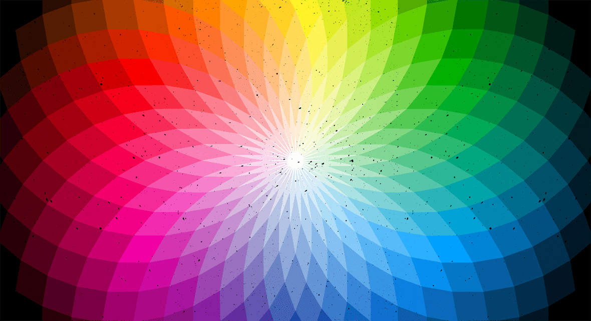
Colors and contrast

Colors are perhaps one of the most impactful visual elements when we first interact with a screen. As a result, there’s a lot of psychological research on colors because of the way we respond to them.
Designers can use specific shades of colors to express urgency, calmness, or motivation. Also, using the same color on components can suggest that particular elements belong together, indicating a content structure.
You can also count on color and contrast to guide or influence users, like suggesting weight and distance in the interface. For example, a bright orange button on a white background immediately stands out and has the power to turn a component into the most noticeable element on the screen.
Size of elements

Using different sizes of components is an easy and even intuitive way to build the Visual Hierarchy of your interface elements. That’s because bigger components draw more attention than smaller ones.
That way, you can use different sizes for menus, buttons, and fonts to determine the importance of elements.
However, don’t forget to consider the balance between each element and how they present together. So before changing size scales, it’s important to establish a criterion for it. Otherwise, an interface could end up having elements that are disproportionate to the rest of its content.
Also, make sure that large elements are, in fact, essential information for the user to focus on.
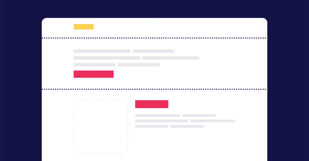
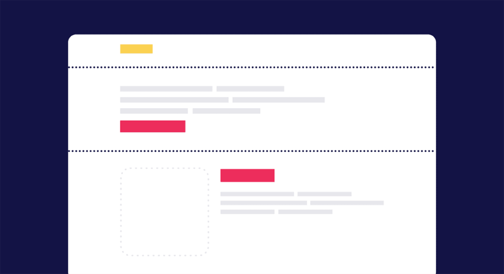
Content alignment

Content alignment provides a sense of organization and order in the interface. Good alignment facilitates readability and makes it easier for users to make sense of an interface.
Imagine a website that has all elements organized and millimetrically arranged. At first, you’ll probably feel a sense of pleasure seeing a well-organized interface.
However, if all elements look the same, nothing actually stands out. This way, having a few components out of alignment can be advantageous to bring attention to that specific information.
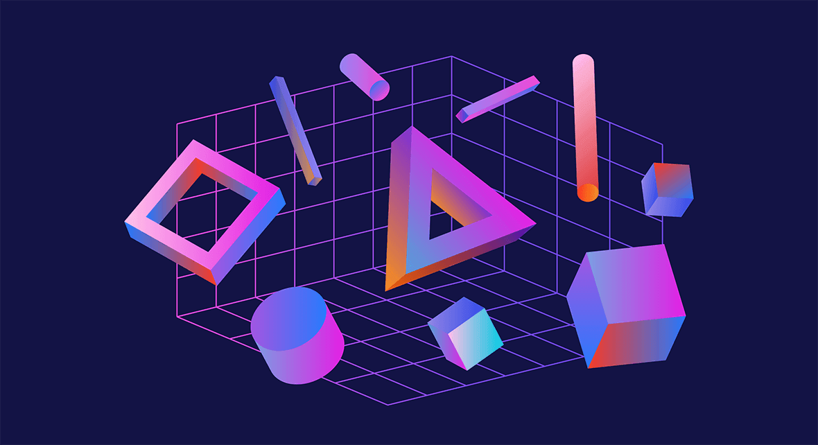
Shapes

Geometric shapes in UI bring a new level of communication with users.
Users can identify the buttons that like, share, download, or content comment through the forms.
In this sense, some forms used on digital platforms have an almost universal meaning for any user.
Therefore, using shapes is an exciting way to build an efficient Visual Hierarchy.
Build your hierarchy, considering the forms that the user is used to seeing, treating them as a crucial element for their interaction.
Motion design

Elements in motion certainly draw more user attention than static ones, so animations can be a great resource to highlight specific components.
Designers usually use Motion in UI to show that an element is interactive, but you can also use it to communicate something unique.
Perspectives

Perspective also has the power to emphasize a particular point or text in your interface and provide the illusion of depth.
Designers can count on perspective in different ways, like:
- different size of components;
- elements moving at different speeds;
- using shadows and blur to give emotion and dramatic effects to the elements.
Another technology that works a lot with perspective is VR — Virtual Reality, interfaces that combine reality with UI Design:
Typography

Typography is responsible for communicating with users and directing them towards specific actions.
There’s a common hierarchy rule to be followed to make sure users won’t miss the most relevant pieces of information in your text and also facilitate the job for people who only want to scan through your content:
- Primary/H1: used for main titles — a header — like in magazines or newspapers, headlines are used to tell readers what the page (section or screen) is all about. Accordingly, the first two words of a header should let users understand the essence of the following text;
- Secondary/H2: second hierarchy of headings, explains the headline and dives into the subject a bit further. Used to indicate subheadings that divide the main text and help readers scan through the text;
- Tertiary/H3: used to highlight content within subheadings;
- Body text: the smaller part of your text.
In terms of SEO — Search Engine Optimization — titles and subtitles can go up to H6. However, as far as UX/UI goes, it’s recommended to keep only the first three levels of the titles hierarchy.
In addition, it is possible to use different fonts to emphasize texts that are essential for the user (always according to research findings and in alignment with user needs and business goals). Generally speaking, bigger and heavier fonts draw more attention.
Ultimately, test with users which fonts, colors, and contrasts work best for your audience to highlight the information that needs to be prioritized — especially when some action from the user is desired, like in a Call To Action.
White spaces can do wonders

If you pay attention to the spaces between content in a website or app, you’ll notice that we have spaces occupied by content and blank spaces with no information. These spaces are known as White Spaces.
White spaces are fundamental to separate elements, guiding the user through a design and making sure to heighten what’s needed. It gives breathing room, turns the page more scannable, and provides relief to users because it doesn’t overwhelm them with information.
If an interface has too much information, people don’t know what to look at first; they can get confused and give up.
This way, white space can provide just what a page needs to make a component pop without effort.
Proximity

The Law of Proximity states that objects that are close to each other tend to be grouped together. So when we see an image like the one above, we perceive these objects as being all part of the same group, as you can see with the circles on the left or from different groups like the circles on the right.
Texture
Notice that richer textures stand out over flat ones, so you can use this to create a hierarchy in your interface.

Of course, avoid using it too much, or you might pollute your interface and distract the user.
In addition, textures tend to overlay other visual resources, like fonts and sizes. So be careful and use it to add balance to your interface, not make it heavier.
Reading patterns
Occidentals generally read from left to right and from top to bottom.
So it’s possible to take advantage of the visualization patterns to improve the readability of your interface and build a more efficient Visual Hierarchy.
The most common patterns people visualize the content on a screen or paper are the F and Z pattern.
F pattern
Interfaces with more written content usually utilize the F pattern, like a blog website.
This way, the user tends to scan the content from top to bottom, and as soon as he identifies words or terms of interest, he reads the content from left to right.
Placing this pattern on a heat map, you can see the shape of an F. Hence the pattern’s name.

Z pattern
The Z pattern is a more appropriate view for browsing pages with less text and more images or other elements.
In this pattern, the user scrolls from left to right from the top of the page. It then descends diagonally to the bottom left of the page so visitors can read from right to left again.
Putting this description more visually, we can find the shape of the letter Z in the visualization pattern.

Visual Hierarchy is essential to draw the user’s attention to the most relevant content in your interface.
People don’t read everything that appears on their screens, so be sure to highlight what is paramount for them to see.
Also, don’t forget to show the actions users can take on your website or app! These are essential fundamentals for a good design and user experience.


.svg)