
Animations make our activities more exciting and less boring. After all, everything is moving.
However, designing animated interfaces or elements in motion is no longer impressive. Quite the opposite! This practice has become essential to catch user attention.
Animation in UI goes far beyond just being an eye-catcher. It’s about providing a good experience, explaining the logic of an app, and improving overall usability so users can understand how to interact with an interface.
But how can we create animations that help users?
Keep reading, and we’ll show you how!
Why is animation important in UI Design?
Animation in UI is not just about developing features to provide surface-level delight.
Animations can be leveraged for usability, taking into account the user’s path through the interface, providing tips and metaphors throughout interactions.
Designers should use UI animations to guide experiences and make user journeys more intuitive and pleasurable. With that in mind, the purpose of user interface animations include:
- To communicate state changes;
- Attract user attention;
- Give feedback;
- Provide relief;
- Improve navigation;
- Teach interactions.
Motion to communicate state changes
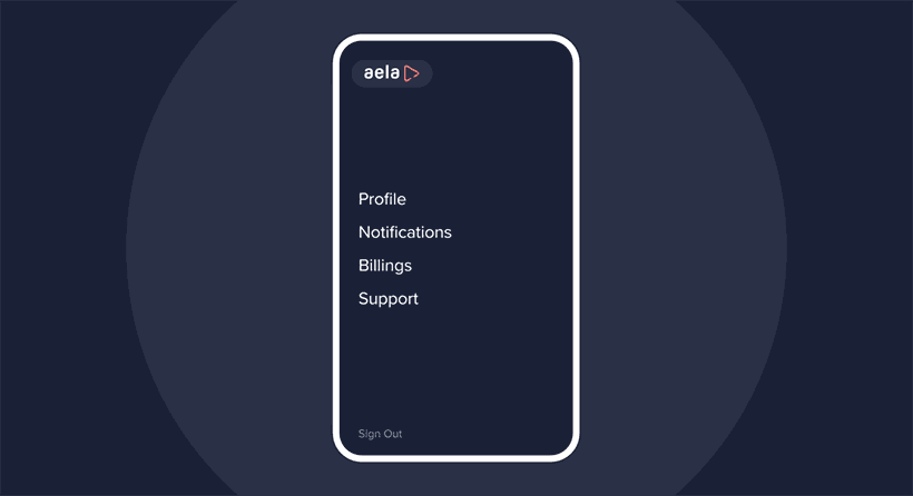
Animations can help in communicating to users about state or mode changes.
According to this, a UI animation can work in two ways:
- Making the mode change noticeable to users;
- Providing metaphors of the mode transition.
For example, the change from a pencil icon into a hand indicates the transition from Edit to View mode in certain interfaces.
Motion to attract user attention
Animations help UX/UI Designers attract user attention to a specific area or a particular element in the interface.
This kind of emphasis is useful to tell users what they should do next.
Motion to give feedback
Animations are also effective in giving feedback after users execute an operation in the interface.
Users must understand whether their actions have been validated – whenever selecting an object or clicking on a menu. Using animation in this kind of situation is a way to provide proper feedback.
Motion to provide relief
Users may feel anxious when an operation in the interface takes longer than expected.
This way, an animation indicating the progress of a task or time remaining for an operation to be completed can help alleviate users’ anxiety.

Motion to improve navigation
UI animation can help users understand which stage of interaction they are at and where they should go next.
Communicating the hierarchy of information within an interface can be quite complex and demands a lot from users’ cognitive skills. In this sense, zooming animations can show the direction of their journey into a hierarchical information space.
However, it’s important to use animation to assist users’ journey, not as a substitute for other visual elements – such as menus and diagrams, for example.
Moreover, animations prevent the user from feeling disoriented, not knowing whether the interaction has gone to the next stage. This advantage is important, especially on mobiles, where spaces are smaller, and contexts can get lost easily.
Motion to teach interactions
Animations help users understand how to interact with UI elements.
For example, if a card expands from the left side of the screen towards the right, it signals to the user that it can be closed by swiping left.
This way, the user intuitively learns how to interact with the elements.
What are the main motion design characteristics?
The development of interface animations must include 4 main characteristics:
- Responsiveness: elements and animations must respond quickly and accurately to user input;
- Naturalism: real-world and physics should inspire interface animations;
- Awareness: animations must be aware of other elements around them. This way, they can appropriately respond and interact with each other;
- Intent: animations need purpose and intent. In this sense, they should guide users through the interface and help focus on important elements.
So, to contemplate these principles when creating motion design in UI, you can base yourself on 3 questions:
- Does the animation have a logical purpose?
- Does it reflect real-world rules?
- Does it propose to improve user experience, facilitating their interactions?
Types of Interface Animation
Before understanding how to create them, it’s important to know what types of UI animations exist.
Overall, we’ve listed 4 types of animations:
- Animations for micro-interactions;
- For presenting the status of a process;
- To explain and clarify;
- Decorative animation.
Although they are independent, it’s quite common for designers to develop animations that gather more than one type simultaneously.
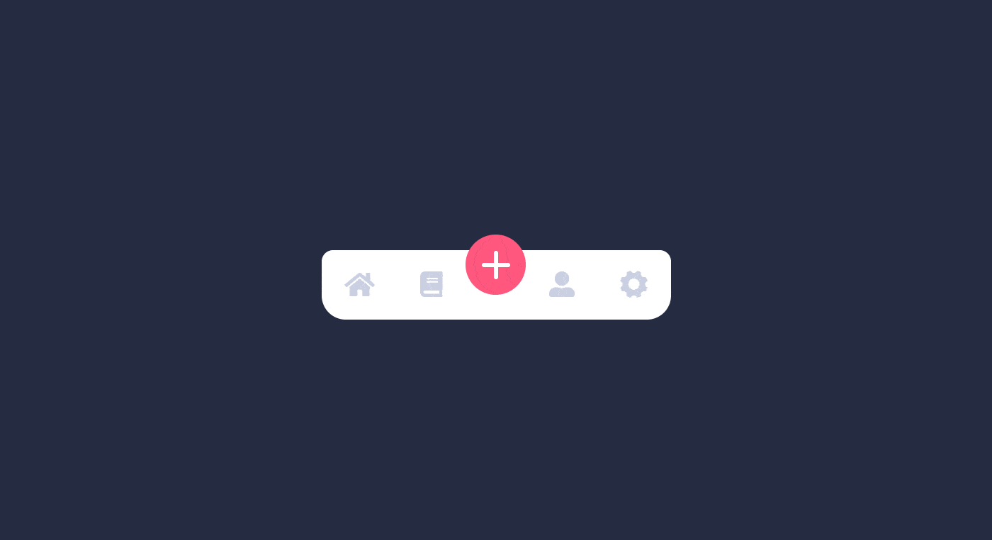
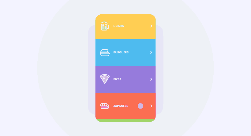
Animations for micro-interactions
Animations for micro-interactions are perhaps one of the most important types.
They include animations of buttons, menus, when opening and closing boxes and windows, and any other simulation of the real world.
Therefore, these animations provide information about the user’s interactions with the interface. This way, users are informed whether a button has been pressed, gaps have been filled, or if an action has been validated.

So even though they are small, micro-interaction animations are handy and important to the user. Adding them to the interface may not get you compliments, but their lack will certainly provide a bad user experience.
Status display of a task
This type of animation, like the previous one, also provides feedback to the user.
Animation for status display is all about different types of progress bars that show the evolution of a task.
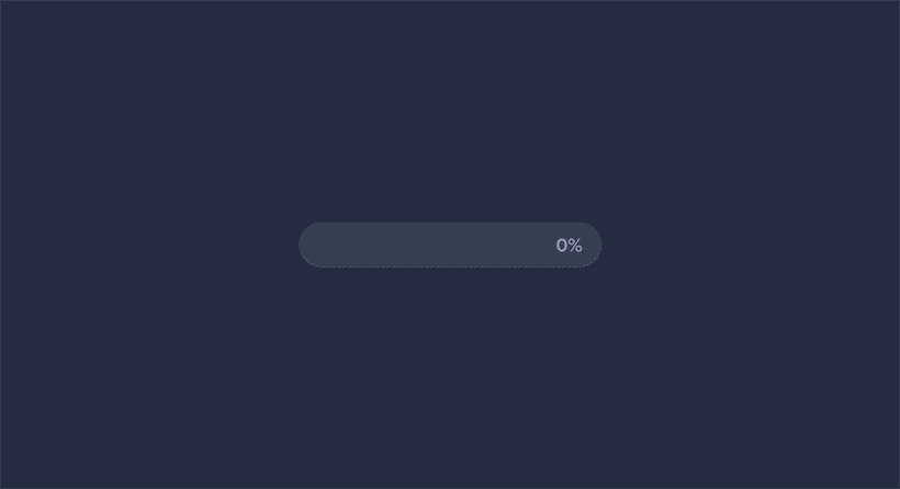
In that manner, users are able to create realistic expectations about how long they have to wait for a specific action to be completed.
It may sound simple, but this kind of UI animation makes a big difference in the user experience with the interface.
Animations to explain and clarify
This type of animation is often used in tutorials or when a user is first accessing an app.
In this context, it’s quite common to animate characters, texts, and details that explain the interface to the user.
This type of animation is important to create further user engagement and inform them about features and stages of the interface that are not so clear at first sight.
Decorative Animation
Animations as decorative elements are purely aesthetic, designed to get users’ attention.
Therefore, it doesn’t have a well-defined functional objective. It’s there to beautify and, of course, decorate.
It’s important to use this type of animation with caution – avoiding distractions or even overloading the interface.
What to consider when creating animation in UI design?
As seen, we’ve learned that animations should help the user, in several ways, to interact with the interface and ensure a good experience.
But what should we consider when designing animations to make sure these goals are met?
Hazwani and Bernard (2016) listed 4 important topics on the subject:
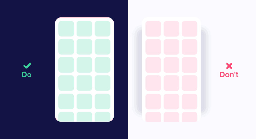
- Simple shifts: Instead of designing entire screens first and later adding the animated transitions between them, try to develop each step considering the individual components and how they change and move in different contexts. This way, building the total structure of the interface will be much easier and more natural later.
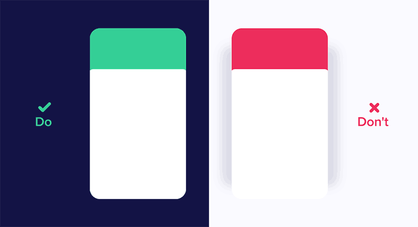
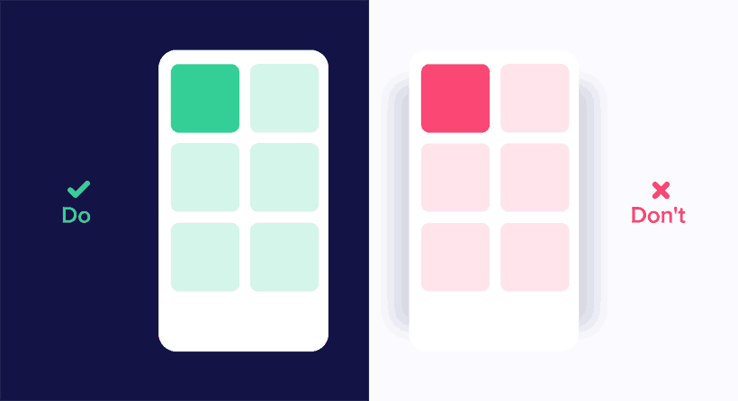
- Explain the relationship between elements: the elements of an interface interact with each other because they are often complementary. As such, animations should contemplate this relationship. If a pop-up emerges from the interaction with a button, the animation must express this;
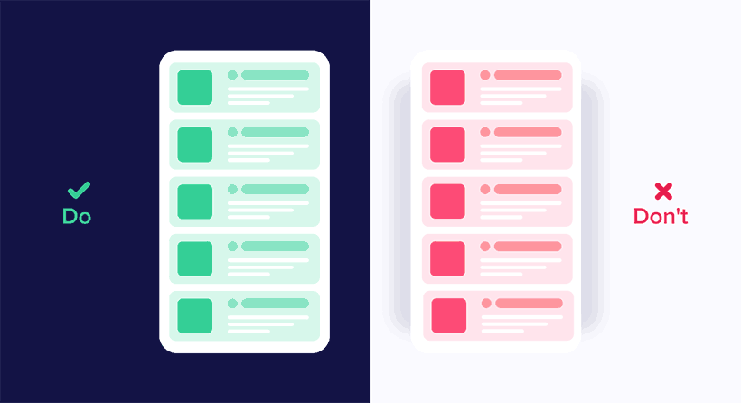
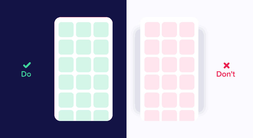
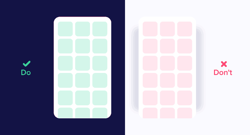
- Avoid multiple representations: an element should not be animated in different ways in the same place. This principle follows the concept of UI standards;
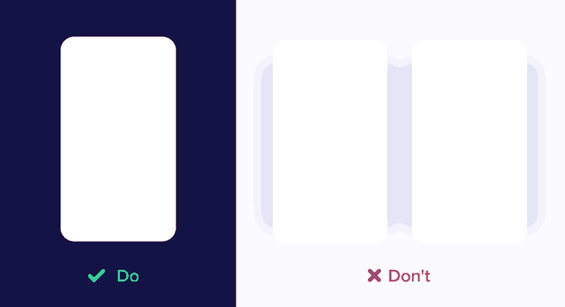
- Keep logic of spaces: if an animation made the menu slide to the left, the user expects it to stay on the left. So it would seem strange for that same menu to reappear from the right.
In addition to these concepts, we will list 5 other factors that you should take into consideration when developing animations for your interface:
- Duration and speed;
- Easing;
- Choreography;
- Secondary actions;
- Follow Through and Overlapping.
Duration and speed
Duration and speed in motion design are two factors that go hand in hand.
So, it’s important to understand that users need some time to interpret and understand how animations work on a certain interface.
Ensure animations are not moving too fast or too slow – that can undermine usability, causing boredom or distracting the user.
But then, what would be the best speed for animations?
Generally speaking, the optimal speed would be between 200ms and 500ms – these numbers are based on our brain’s processing capacity. Animations with less than 100ms are not perceived by us.
However, we should take into consideration some factors that may impact the ideal speed of an animation:
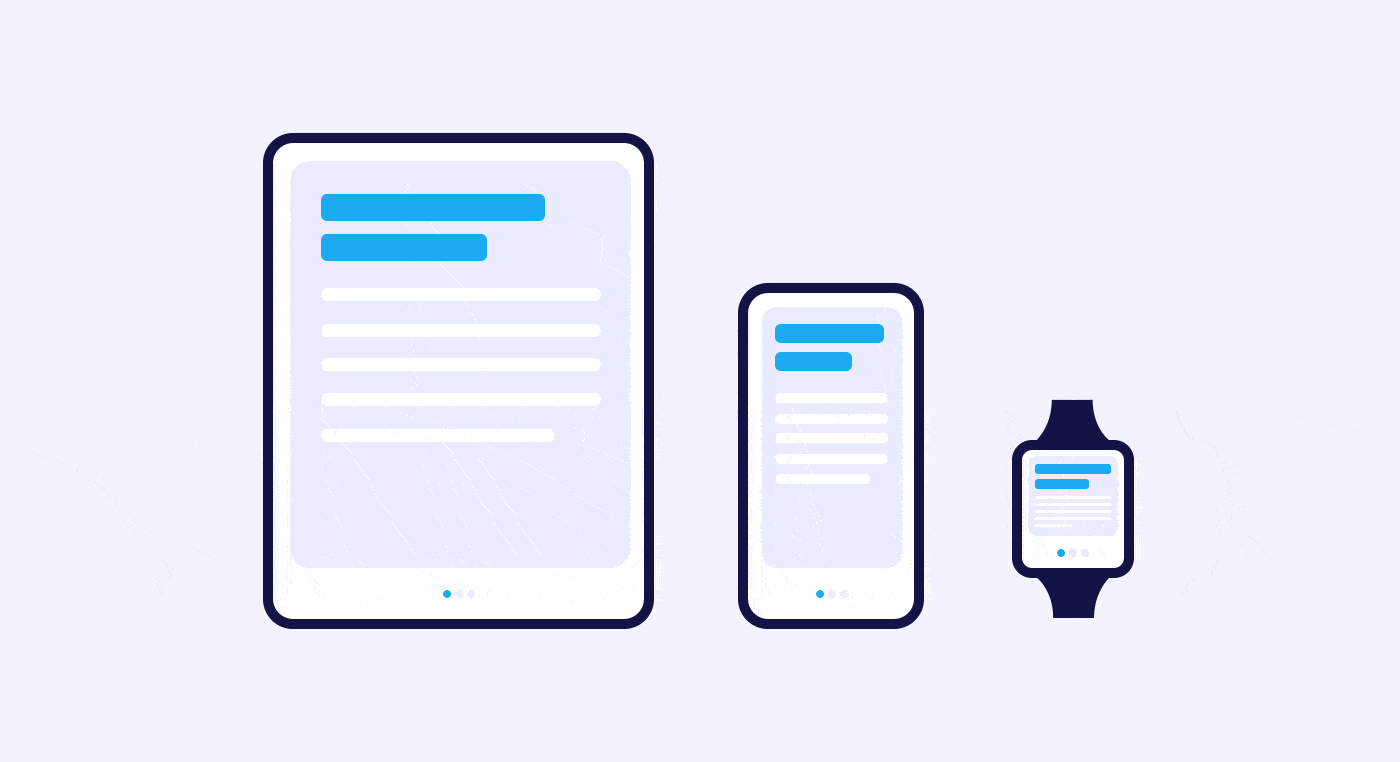
- Screen size: size can influence speed for physical reasons – there is less room for movement. Therefore, for mobile screens, speed should be between 200-300ms and between 400-450ms for tablets;
- Web animations: because we are used to instant transitions on websites, we expect animations to be faster on this platform as well. So for websites, transitions and animations are good with speeds between 150-200ms.
Keep in mind that the numbers above are good practices, not rules set in stone.
If you are developing a decorative animation, speed and duration may be higher and longer.
Also, consider all the factors surrounding the sense of speed and duration of animated elements, including their size.
Smaller components, such as quick changes tend to be faster. In the same way, larger elements tend to move slower.
All these factors make animations appear more natural and realistic.
Easing
Easing is the technique used to make movements of animations more natural.
In the real world, speeds are not constant – unless you are in a vacuum. In other words, there is always acceleration, deceleration, and smoothing movement.
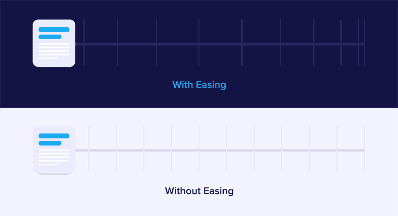
In this sense, easing determines the speed variation that takes place during a complete movement.
Thus, consider the following types of easing:
- linear movement;
- ease-in;
- ease-out;
- ease-in-out.
Linear movement
Linear motion happens when an object has constant velocity. That is, there are no physical forces that constrain the motion.
Because of this, these motions can look a little strange to our eyes.
Its use is advisable for status and mode changes of an object, not for position changes.
Ease-in
The ease-in corresponds to an acceleration curve of the elements.
In this sense, this technique is generally used when an object comes from rest mode and then leaves the user’s field of view.
In the curve, we can see the initial position of the object changing slowly and its speed increasing gradually.
However, don’t forget to use ease-in only when you want the elements to leave the user’s view permanently.
Ease-out
Easing-out corresponds directly to the opposite of easing-in.

Therefore, this technique should be applied to objects on the screen and gradually decelerate until they reach the desired position.
Ease-in-out
Ease-in-out is also known as the standard curve.
It’s the junction of ease-in and ease-out. This way, it represents the acceleration of an element from zero (rest) and its deceleration until it stops again.
As such, this technique is often used to animate elements that change position on the same screen.
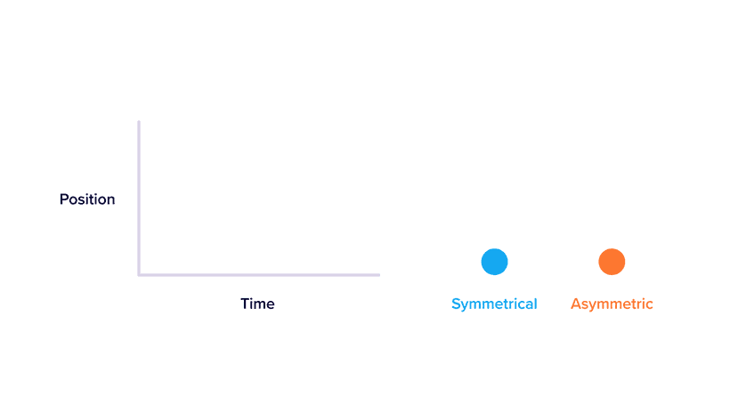
However, note that an asymmetric standard curve turns the movement of objects more natural. So when using this curve, be sure to emphasize deceleration more than acceleration. This will reduce the duration of the initial movement and prolong the final one, drawing users’ attention to the new object’s position.
Choreographies
Choreographed movements are more enjoyable to watch than uncoordinated ones.
The main idea of this technique is to guide the user’s attention through more fluid movements during transitions.
There are two types of choreography:
- equal interaction;
- subordinate interaction.
Equal interaction choreography
Equal interaction means that objects move based on the same rule.
In that case, your presentation becomes coordinated and more pleasing to the eye.
Take, for example, the appearance of cards on a screen; equal interaction choreography determines that they will appear in a coordinated way, one after the other, from top to bottom.
This technique gets a bit more complicated when we have elements arranged in a grid.
In this case, the objects must appear diagonally. If you use a horizontal ordinal direction, the user’s attention will be zigzag-like, making the experience less pleasant.
Subordinate interaction choreography
Subordinate interaction choreography is when one central object attracts all user’s attention, and all other elements are subordinate to it.
This technique keeps user attention on the most important object of the animation. If, for example, several elements move, it’s important to make the sequence of movements clear.
In addition, it’s important to pay attention to the curve of movement of objects.
If an object changes size disproportionately – a square becoming a rectangle, for example – the movement should occur in the form of an arc.
However, if the object’s size changes proportionally, the movement should happen in a straight line.
Thus, we can divide the movement curve into two categories: Vertical Out and Horizontal Out.
- Vertical Out: is the movement that begins horizontally and ends vertically;
- Horizontal Out: is the movement that begins vertically and ends horizontally.
What determines which type of movement to use is the main axis of the scrolling interface. So if the scroll is vertical, objects should move accordingly – in a Vertical Out way. In the same way, if scrolling is horizontal, you should use Horizontal Out instead.
Another important issue is the path of objects when intersected. They should not move through each other if their paths cross. In this regard, animations should always follow the laws of physics.
Therefore draw the movement of objects cleanly and clearly, without the interference of other elements. Another option is to lift the object above the others before moving it. This way, the animation will look more natural.
Secondary actions
Secondary actions are those that complement the main movement.
So think of an animated character walking. Although the movement of the legs is the main action, he should also be moving his arms.
However, these secondary actions are not so obvious in the interfaces – since there are no arms to move.
Nevertheless, the elements are interrelated, and we need to consider how they could create secondary actions to improve the user experience.
Follow Through and Overlapping
Follow Through happens when a moving object slightly overshoots the position of its final destination and then comes back to stop.
Imagine a moving car that brakes until it stops. Then, it moves a little further forward before returning to the place it should really stop.
Overlapping means that not all parts of an object stop moving at the same time.
In the example above, the arrows and icons stop moving at different times.
Benefits and Disadvantages of UI Animations
When we think of interface animations, several benefits immediately come to mind, such as:
- increase usability;
- originality and creativity;
- facilitate interactions;
- provide instant feedback to the users, creating helpful expectations;
- holding user attention to important elements.
However, despite having many benefits, use animations with caution. Otherwise, they may end up bringing a few drawbacks.
In this context, have in mind issues like:
- loading time: if your animations are heavy, the interface may need more time to load them. As a result, this waiting time can be negative to user experience;
- animation overload: every movement should have a purpose within an interface. Thus, creating too many animations to attract user attention may not be a good strategy. An overloaded interface can become tiring and drive users away.
- distraction: animations should draw the user’s attention to important objects in the interface. Whereas, if used randomly, they can cause just the opposite and distract users during their journey
Tip: software and apps for creating animations
There are many software and apps to create animations for interfaces.
Here we mention 4 of them:
- ProtoPie;
- Principle;
- After Effects;
- InVision Studio.
ProtoPie

ProtoPie brings interactions, animations, and prototyping together in a single application.
With it, you can create high-fidelity prototypes in a clean, simple, and easy-to-use interface.
In addition, ProtoPie allows you to test the interface on any mobile device and integrates with other programs, such as Sketch.
Principle

With Principle, you can create animated interfaces even if you don’t know how to code.
In addition, Principle can synchronize your interface in real-time with the mobile app. This way, you can see the preview both on desktop and cell phone.
One disadvantage of the program is that it was developed exclusively for MAC OS. So it may be tricky to use for those who are not familiar with it.
After Effects

AE is a rather old tool, and although it was created for the audiovisual market in the 90s, it’s commonly used to build interface animation.
Despite being a powerful tool, AE is not a prototyping program by itself.
InVision Studio

InVision Studio brings a bucket full of features and interactive elements to be used when developing your prototype.
With it, you can easily customize animations and transitions based on various actions and gestures.
Plus, you can responsively create elements to suit all screen sizes.