
Have you ever created an interface that you thought was innovative and groundbreaking, only to find that users didn't respond well to it?
This can be a frustrating experience, but it's important to understand that there are certain user behaviors that should be respected when designing interfaces.
These behaviors are the basis for the Laws of UX, which are essential guidelines for creating interfaces that are both innovative and effective.
In this article, we'll explore some of these laws and how you can apply them to your own designs. So, let's get started!
This text is based on lawsofux.com, where you can find more information on the subject.
What are the Laws of UX?
When creating an interface, conducting research and understanding your users is crucial. But even though each person is unique, common behaviors apply to all users.
These fundamental behaviors underpin the Laws of UX, which are essential principles to consider in any interface design.
Backed by psychology studies and research, these laws provide a framework to guide UX design and ensure that the user experience is effective and enjoyable. Neglecting these principles can have negative consequences for your interface and users.
Reading Tip: The Importance of Psychology in UX Design
1) Aesthetic Usability Effect
The Aesthetic Usability Effect is a UX principle that suggests that users tend to associate the aesthetics of an interface with its usability.
If an interface looks attractive, users are more likely to perceive it as easy to use and effective. Conversely, if an interface looks unappealing, users are more likely to have a negative perception of its usability.
As a result, users may become more forgiving of minor usability and interface issues if the product has a pleasing aesthetic.
Apple's products are a good example of this principle in action, as they are known for their sleek and modern design. Even if there are some usability flaws, users may not notice or may not view them as significant due to the overall aesthetic appeal of the product.

While the Aesthetic Usability Effect can have a significant impact on users' perceptions of an interface, designers must not be deceived into thinking that aesthetics can make up for major usability problems.
For instance, in e-commerce, if users struggle to find a product or complete a purchase, no amount of visual design can compensate for such usability errors.
Thus, usability and aesthetics are two complementary aspects that should be considered together when developing an interface.
Investing in visual design can enhance the interface's appearance, making it look polished, professional, and appealing. However, designers should also ensure that the interface is easy to use, efficient, and error-free.
Ultimately, the goal is to create a product that not only looks good but also functions effectively, providing a positive user experience that meets users' needs and expectations.
Reading Tip: Redesign: Are You Sure About It?
2) The Doherty threshold
The Doherty threshold is a fundamental principle of UX design that concerns a system's response speed.
In the 1970s, IBM manager Walter Doherty realized that user productivity increased or decreased according to the response speed of computers.
This observation makes intuitive sense: the faster an interface responds to user input, the more efficiently users can perform tasks and take subsequent actions.

The Doherty threshold highlights the critical importance of interface response time in UX design.
Slow interfaces can severely impact usability, causing users to have negative perceptions of the interface and potentially abandon the page altogether.
In fact, research conducted by Google indicates that users are 32% more likely to leave a page when loading times increase from 1 to 3 seconds.
To avoid such negative outcomes, it is essential to optimize your website or app so that it responds quickly to user interactions. Ideally, your interface should respond within 0.4 seconds to provide users with a seamless and efficient experience.
By streamlining your interface and minimizing any unnecessary delays or bottlenecks, you can ensure that users remain engaged and satisfied with your product.
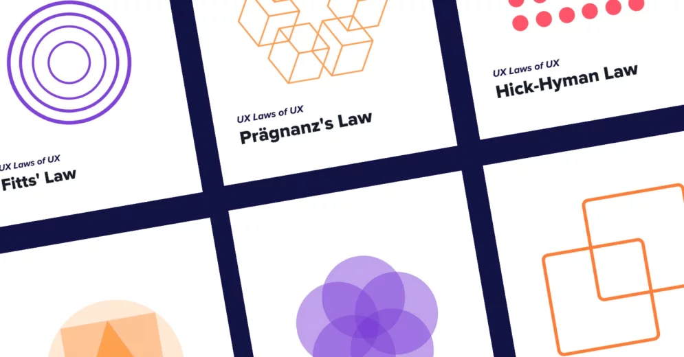
3) Fitts' Law
Fitts' Law is a fundamental principle of UX design that concerns the user's action time in relation to an interface. Unlike the Doherty threshold, which relates to interface response time, Fitts' Law pertains to the time it takes for users to understand the interface and take action.
A poorly designed site can significantly compromise the user's response time, primarily due to small or poorly placed clickable elements such as buttons. To ensure optimal user interaction and experience, consider implementing the following tips:
- Make clickable elements appropriately sized: buttons should be large enough to be easily seen and clicked by users.
- Place clickable elements in accessible locations: buttons should be placed in logical locations and arranged to minimize user search time.
- Use consistent design patterns: consistent design patterns can help users quickly understand how to interact with an interface, reducing cognitive load.
- Use clear and concise language: instructions and calls-to-action should be easy to understand and use simple language.
By implementing these tips, designers can help reduce user frustration and improve overall satisfaction with the interface.


To best utilize the concept of this UX Law, take into consideration:
- Interaction elements should be visible, distinct, and sized well for user interaction;
- Understand the physical limits of the screen of your interface. All interactions should happen there;
- The distance between a user's task/attention area and the task-related button should be kept as short as possible;
- Pop-up Menus tend to be better choices than Dropdown Menus.
Matching your interface to Fitts' Law is important to avoid leaving the user with the impression that your product is complicated to use.
Reading Tip: Gestalt Principles: How To Apply Them In Your UX/UI Design Projects
4) Hick-Hyman Law
One of the principles of User-Centered Design is that the interface should meet the user's needs and make their life easier.
Therefore, the interface of your product should be intuitive and user-friendly, minimizing complexity and confusion.
The Hick-Hyman Law, one of the Laws of UX, states that the more options and choices available to the user, the longer it will take them to decide.
Thus, it's crucial to ensure that your interface isn't overly complicated or filled with too many options. If necessary, consider dividing the process into smaller, less complex parts.
This principle is especially relevant for e-commerce websites where finalizing an order often requires several pieces of information, such as an address, payment method, registration, etc.
By simplifying the process and reducing the number of choices at each step, you can make the user experience smoother and more efficient.


If all this information is requested at once, the user may feel confused and overloaded, possibly leading to them giving up on the purchase. On the other hand, it is common for this step to be broken into several parts, one on each page, to simplify user interaction.
Thus, it's important to analyze all the interactions that your user has with the interface. Understand if there are moments in which they spend too much time, and try to break this process into smaller steps to improve their experience with the interface.
5) Jakob's Law
Jakob's Law is a fundamental principle in UX design, named after Jakob Nielsen, one of the pioneers of usability research. The law states that users are accustomed to the conventions and standards of other websites they frequently use, and they expect your website to work similarly.
In short, Jakob's Law highlights the importance of designing interfaces that are consistent with users' mental models and expectations to minimize cognitive load and improve usability.
The user has certain expectations about how an interface should work based on common sense. For instance, certain colors like red, yellow, and green are associated with specific meanings, such as red for stopping or something negative and green for a go-ahead or something positive.
If you reverse these meanings, it can lead to negative consequences, such as accidents. Therefore, it's important to adhere to the conventions and standards established in the industry and not deviate too much from the user's common sense expectations.

It's common to fall into the trap of wanting to do something unique and innovative to differentiate ourselves from our competitors. While it's important to stand out, it's equally important not to be so disruptive that the user becomes confused.
When developing an interface, it's important to keep in mind that your user is accustomed to interacting with many similar interfaces. Therefore, it's important to maintain certain interactions and not break your user's expectations.
In addition, you can innovate and create better experiences by leveraging existing mental models, in which the user can focus on their task instead of learning new models.
Reading Tip: Animation in UI: How to Create Motion Design
6) Prägnanz's Law
Our eyes tend to interpret complex shapes in the simplest possible way, avoiding great cognitive effort.
That is, when we come across a shape that we can't identify, we have a tendency to break that image down into simpler shapes.

Prägnanz's Law states exactly that. Our eyes prefer to find simplicity because it prevents us from information overload.

That way, always try to use simple shapes to compose the structure of your interface because that is exactly how the user will see it.
Reading Tip: Creating Responsive Design With Grids
7) Miller's Law
We have a cognitive ability that comes into play every time we encounter a new interface. From that moment, a learning process is initiated, and our brain starts to understand how to use that interface.
In addition, we have limited working memory. That is, our capacity to store new information is limited.
In this respect, working with the Laws of UX, we get to Miller's Law.
Miller's Law describes that our immediate memory is limited and its total capacity is about 7 "chunks of information".
As a result, it is crucial for interface development to consider ways to avoid overloading the user's cognitive capacity and immediate memory. Otherwise, the user may feel confused and the experience may be negatively affected.
Therefore, in your interface, it’s recommended to avoid:
- Providing too many choices and options for the user;
- Making the user think too much;
- Lack of clarity in interactions;
- Clustering too much information.
A simple example is the formatting of large numbers such as telephone or postal codes. With all the numbers together, reading becomes confusing. If we separate them into blocks, our experience will be better.

This way you ensure that the user spends his cognitive capacity, memory, and attention on the important elements of your interface.
8) Occam's Razor
We can observe that the Laws of UX exist so that we can simplify our interfaces and make sure the user has a good experience.
This UX Law describes that we should always choose the simplest solution to a given problem. Instead of choosing the most complex one. In other words, cut with a razor what is not relevant.
Translated to the UX world, this means that we should cut out the excess design elements from the interface, without compromising its functionality.


Designers often include multiple elements that serve the same purpose, as there are many design solutions and tools available.
However, this UX Law suggests reevaluating your design and removing any elements that make your interface more complex in order to simplify user interaction.
This will result in a simpler, more efficient interface, providing a better user experience.
9) Pareto Principle

The Pareto Principle is quite common and widely used in several situations and areas. Maybe you have even come across this UX Law before.
The concept around this principle describes that 80% of your results are a consequence of 20% of your efforts.
In other words, the relationship between cause and effect is never equivalent. It is, in fact, disproportionate.
So understanding the concept of the Pareto Principle helps you to size up your efforts when you are revising or updating your interface.
For example: after a user survey, you discover that there are several interaction problems with your product. But you cannot adjust all the inaccuracies, due to limited time and budget.
This way, you can analyze your survey data and identify which 20% of the errors affect 80% of your users. By doing this you focus on a problem that affects the majority of your users, rather than worrying about something that affects fewer people.
Remember that the numbers will not always be 80 and 20. This ratio tends to fluctuate slightly over time. The important thing is that you understand that this ratio exists and can help you save unnecessary efforts.
Reading Tip: User Interview: Keys to Gather Insightful Information
10) Parkinson's Law

You, as a designer, are probably used to working with projects and deadlines. Perhaps you have already experienced the following situation:
If you have a task to accomplish and your deadline to deliver is one week, you will invariably spend 7 days working on that task.
On the other hand, if your deadline is only one day, you will do what is necessary to accomplish the task in that short time.
In other words, the time it takes you to complete a task is related to the deadline you have to deliver it. In this way, Parkinson's Law, one of the Laws of UX, states: "Tasks tend to take up all your time”. Tasks tend to take up all the time available to accomplish them.
We have a false impression that the more time to do a job, the better the result. However, when we have too much time, our brain relaxes and might lose focus. On the other hand, when we feel some pressure on the delivery time, we become more focused and tend to be more efficient.
Of course, the purpose is not to work with unrealistic deadlines, but putting a little pressure on the system helps to maintain focus and to disregard what is not important.
Ok, and how is this law related to UX?
The user will also suffer the influence of time in relation to some action on your interface. In this way, it's interesting to make sure that the user does not lose focus on the action they are doing. Beware of using too many elements that can make this whole process inefficient, making the user tired, and possibly making them give up the interaction.
11) Peak-End Rule

The Peak-End Rule is a psychological theory that is sometimes interpreted as a cognitive bias. Due to its relevance in psychology, it has been frequently applied in UX design and is now considered one of the UX Laws.
This Law addresses how we are susceptible to remembering more intensely the peak and final moments of an experience.
If we take the example of a vacation trip. You are more likely to remember the best and worst moments – like a memorable trip or the loss of your passport, for example. The end of your trip will be more latent as well. In this way, you remember the last days of your trip more than the initial days.
So, when putting this UX Law into practice, it's important to worry about the peaks of emotion that are reached during the User Journey.
If the user has some difficulty at some crucial moment in the interaction with the interface, this moment will be a peak of emotion and will be recorded in their memory. So will the final moments and actions of their Journey.
Thus, it’s important to understand which are the crucial moments of the user's interaction and ensure that this emotional peak is positive. Also, keep in mind the end of the process, how can you make the end of the user's Journey better?
Tip: Avoid using pop-ups and "please don't leave the page" messages. These elements can contribute to a negative impression of your interface.
Reading Tip: UX Writing: How Words Can Help User Experience
12) Postel's Law or Robustness Principle
Postel's Law, also known as the Robustness Principle, was originally intended as a guideline for data transfer between software systems.
However, it has proven to be applicable to UX design as well. The central idea of this law is to "be conservative in what you send, be liberal in what you accept."
In the context of UX design, this means that you should accept any form of input from the user while providing precise feedback.
Postel's Law suggests that designers should prioritize robustness and flexibility when designing interfaces. By doing so, they can create interfaces that accommodate various user needs and ensure a positive user experience.

When a user fills out a registration form, they are required to provide their ID number. The ID number can contain dots (.), dashes (-), and sometimes even letters.
The role of UX Design is to allow any format of input, be it with dots, only numbers, with letters, or without them. The user must have the freedom to enter the data in a way that is most convenient for them.
Moreover, if there is an error when filling out the form, it is important that the UX tells you where the error is.
Instead of simply sending a message saying that there is a filling error, it's essential to indicate which fields need to be changed and the correct way.

13) Serial Position Effect
The Serial Position Effect is a UX Law that relates to the physical position of elements in a sequence. It states that we tend to remember the first and last elements in a sequence more easily than the middle ones.
This leads to two other concepts: the Primacy Effect and the Recency Effect.
The Primacy Effect refers to the tendency to remember the first element of a sequence due to the fact that it requires less effort and processing by our brain.
Conversely, the Recency Effect refers to the tendency to remember the last elements of a sequence because they are fresh in our memory.
So how can the Designer use this UX Law to their advantage?

To take advantage of the Serial Position Effect in UX design, place the most important elements at the beginning and end of a sequence, as these are more likely to be remembered by the user.
The less important elements should be placed in the middle, where they require less user interaction and are less likely to be remembered.
Reading Tip: 9 Usability Errors And How To Avoid Them
14) Tesler's Law
While it may seem obvious that the interface should be as simple as possible for the user, Tesler's Law proposes that the complexity of a system never truly disappears.
Rather, it shifts from one place to another and affects different agents.
When the decision is made to simplify an interface feature, the complexity is transferred from the user to the developers.
This creates a dilemma: Is it worth spending more time and resources on development in order to remove complexity from the user and create a simpler journey for them? The answer is not always straightforward.

Removing complexity from the user may also mean removing control that experienced users need to have a better experience. On the other hand, simplifying the user's life by reducing cognitive load and effort required can improve the overall user experience. The decision ultimately depends on the project, the persona, and the available resources.
It's essential to evaluate the impact of adding or removing complexity on the user experience and weigh the benefits and drawbacks carefully.
Ultimately, the goal should be to create a user-friendly interface that meets the user's needs while balancing complexity and simplicity.
15) Zeigarnik Effect
Have you ever stopped to think why it is so hard to get that series you haven't finished on Netflix out of your head?
One of the explanations is based on one of the Laws of UX: the Zeigarnik Effect.
The concept behind this law is simple: we tend to remember incomplete or interrupted tasks better than completed ones.
So, we can say that it is hard to forget a series because we haven't watched the whole plot yet. Each episode shows us only a piece of the whole, and we become anxious to know the final outcome of the plot.

But how does this effect apply to UX Design?
The Designer can use this UX Law to grab the user's attention and make them remember actions and tasks that are still incomplete. In this way, the user creates engagement with the interface.
A good example is progress bars. Several interfaces use this element to demonstrate the status of an action, the progress of a course, or the completion of a profile. LinkedIn uses the Zeigarnik Effect to show the evolution of the user's profile on the platform.

By designing an interface that engages users with an activity, you can encourage them to complete the task without interruption.
The Laws of UX provide guidelines that can help you create a better user experience.
While you don't need to apply every law to your interface, neglecting all of them can significantly impact the user's journey.
To make the most of these laws, carefully evaluate which ones best fit your design needs and incorporate them thoughtfully.