Even for those who have already read the first edition of this book, delving into this fully updated 3rd edition presents an excellent opportunity to revisit and reinforce usability concepts.
Originally designed to be read in under two hours, covering the most crucial usability principles, the book's intention remains unchanged.
Within these pages, we have curated a selection of key insights that aim to refresh core ideas about usability for those interested in the realm of UX and UI.
1) Usability is…

The concept of usability simply emphasizes that anyone should be able to use products without finding the process frustrating and complicated.
In this sense, usability ensures that things work well and are easy to use for their intended purpose. Want an example of a product with extremely high usability? Spoons. They perfectly fulfill their purpose!
Reading tip: Usability Test: How To Prepare And Conduct One?
2) Things should be self-explanatory
When you access a website, a mobile app, or another digital product, you should quickly be able to understand how it works and what it is about.
In this sense, making processes and objectives obvious is also an important factor of trust in websites, applications, and companies; it ensures that the usability and user experience are good.
3) Don't make me think! Minimize cognitive load
As a general rule, people don't like to have to guess how to perform a certain process or activity. Therefore, if your interface requires users to think too much, they will become frustrated.
Users don't want to deal with your website or application as if it were a complicated puzzle. They want to know what needs to be done immediately and do it quickly.
Hence, the more people have to think to take action, the higher the probability that they will abandon your interface and seek out your competitors.
4) Nobody wants to waste time!

People go online to save time, not to waste it. If you squander the user's time, they will leave. The loading time of a website is a crucial factor for its ranking in Google search results.
We generally don't like when a page or application keeps us waiting. It negatively affects usability and the overall user experience. Users are like sharks, they need to keep moving, or they die.
Reading tip: How To Create Valuable User Personas That Will Actually Matter?
5) Allow the user to go back
The back button is one of the most commonly used features in web browsers today. It is important that they can easily return to the starting point if they get lost or make mistakes along the way.
So, please make sure that the user is able to click the back button multiple times to retrace their steps and find their way back during a specific journey.
6) We are creatures of habit
When we find something that works and meets our needs, we tend to stick to that process, even if it's not 100% efficient.
In this regard, if a user discovers an interesting way to solve their problem, they are unlikely to seek out another solution with better usability, even if it exists.
Habit keeps us tied to a familiar process that, in a way, helps us.
7) Straight to the point!

Similar to how we don't like to waste time waiting for a page to load, we also have little patience for unnecessary processes or steps.
Therefore, eliminate any unnecessary detours from the conversation before providing users with what they need.
Nobody is on the internet to see fancy tricks; everyone wants to go straight to the point. So, make sure your websites and applications deliver that.
8) The search bar
People have become reliant on search capabilities within websites and applications. So, it is essential to have a search feature within your interface.
Many users look for this feature as soon as they enter a page or app. If they cannot find a way to search and find what they desire, they might go straight to another website.
Reading tip: How I Got My First Job in UX Design in Switzerland – Interview With Kevin Panchaud
9) The site map should be handled with care
People tend to remember their experience with websites and applications, creating mental maps and recalling steps.
This way, they learn where to find what they want and how to accomplish the tasks they need to complete.
When you make radical changes to a site's map, you disrupt people's ability to remember the steps, which can make things difficult for returning users, impacting their usability and experience.
10) Always show how to go back Home

The home button is like an emergency exit for users when they feel lost in your interface.
If the user becomes so disoriented that the back button is not sufficient, a simple click on the home button will bring them back to the starting point, allowing them to begin again.
In this regard, ensure that this button is prominently displayed and obvious, as it provides valuable assistance to the user.
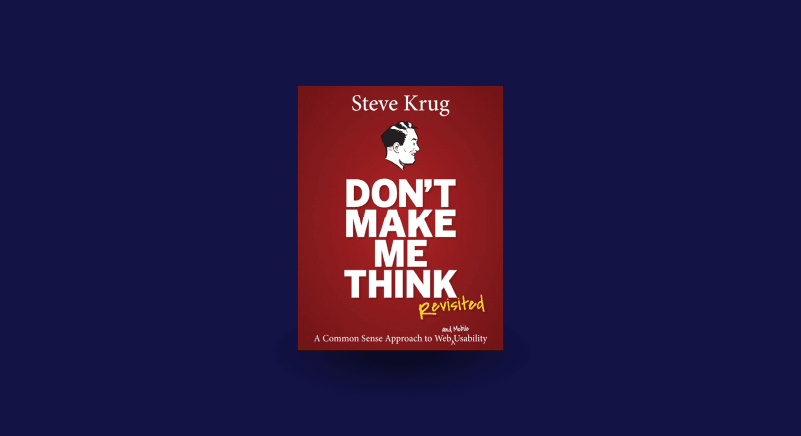
Final thoughts
In summary, "Don't Make Me Think" is a book about simple ideas and practical ways to implement them.
While there are other usability concepts beyond those covered by Krug, the most important ones are presented.
Usability is just one of the four main pillars of UX, which also include utility, accessibility, and functionality, and it is crucial for creating amazing apps and websites.