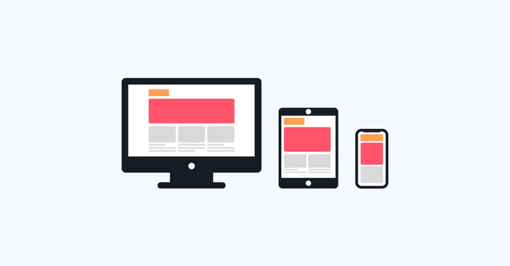
The grid system is one of the most important tools in UI Design. It helps designers to create responsive layouts more simply and easily.
You might start writing an email on your home computer and finish it from a tablet or cell phone on your train commute or in a coffee shop.
We access content through different devices and screen sizes. And these apps should adapt to make tasks accessible for you, no matter the screen size you’re working on.
So the main issue today is adapting content to the different screens and devices in our hands. If you’re looking to know more about it, wait no more. This article will guide you through the foundations of grids.
Reading tip: Alignment in UI: The Invisible Structure Behind Designs
What are Grids?

A grid is a structure formed by invisible lines that divide a page into columns or modules. These columns help designers align and organize page elements through their designs.
Working with a grid system allows designers to adjust and align elements, helping maintain consistency with little effort.
To understand how important they are, just imagine how difficult it would be to resize all the elements on a page, trusting your eyes only or “gut instinct.”
More precision and flexibility
Grids facilitate the alignment of elements within a page and are also essential to ensure design consistency.
The scheme of columns, rows, and white spaces works as a framework for the page’s layout, making it possible to design apps and websites responsively with more organization and precision.
Therefore, Grids provide even greater flexibility for cross-platform responsiveness with screens of different sizes.
This flexibility allows your interface to adapt to different devices and deliver the proper interaction for each screen size without driving designers crazy.
Reading tip: Typography in UI: How To Enhance User Experience
Grids are an old concept
It is quite easy to imagine how valuable grids are in a technological context, with apps, websites, and software that need to be filled with content.
But this tool has been around for a long time. Grids were used to organize elements in books and even in Renaissance art, where artists looked for a perfect geometry.

In the 13th century, a French architect developed a technique still used today: the Villard de Honnecourt diagram.
This technique, named after its creator, mixed the grid system with the golden ratio concept to create layouts with margins based on fixed ratios.

Terminology
Before we get into the types of Grids and how to use them, let’s first understand the terms involved in this concept. So we will briefly explain the following:
- Columns;
- Gutter;
- Margin;
- Breakpoints;
- Fields.
Columns

Columns are the foundation of grids. They determine the area where the content will be positioned.
The width of each column is measured in percentages rather than in fixed numbers, allowing professionals more flexibility to design for different screen sizes.
The number of columns will depend on the size and resolution of each screen breakpoint. The most common frameworks use a grid system of 12 equal-width columns; this provides designers a lot of flexibility over a layout.
But of course, there’s no point in using a 12-column grid if your design only needs 8-columns.
Gutter

Gutters are the space between the columns. Their function is basically the same as whitespaces: to provide breathing room to the layout.
Margins

Margins are the negative space between the border and the outer edges of a format; they go around all four sides of the content. Designers can target and change the margin for each side.
Breakpoints

Breakpoints are the point at which a website’s content will change and adjust to fit the screen size of the user. So, the layout adjusts to suit a specific orientation at a given breakpoint range.
Each device has particular breakpoints according to its screen size; think mobiles, tablets, watches, and desktops.
Ultimately, breakpoints are pixel values that developers or designers can define in CSS. This way, when a responsive website reaches the pre-defined pixel values, the layout changes to provide viewers with the best experience possible.
The concept of breakpoint is essential to understanding responsive design. You can check a table with the breakpoint ranges for each device in the link below:
Fields or Modules

Fields or Modules are the intersections of rows and columns. These blocks are the foundation of a page because all design elements will fit into these units of space created by the rectangular patterns in a grid.
Keeping your fields at the same height might be good, but that’s not always possible.
Interface design and grids
If Grids were essential in the past for printing, today they are indispensable in the digital world.
Grids became a crucial tool for developing digital products, aiming at the best user experience on all devices.
Therefore, regardless of the screen size, designers must be able to organize content in the best possible way on each screen. Because of this, the use of a Grid system in UX/UI Design is indispensable.

How to use a grid system in your project?
Grids are structures with columns, Gutters, and margins, whose purpose is to help organize the content of an interface.
The first important step to start using Grids is to understand how to configure it to serve you in the best possible way.
How to create a Grid
For starters, you can configure the widths of Gutters and Margins of your Grid. With this, you will automatically have the width of the columns as a consequence.
You can adjust the width of the Gutters to have more or less space between columns. The narrower the Gutters, the more it feels that the field elements are part of the same group.
Consequently, the wider the Gutters, the more it seems they are a different type of content.
However, be careful that gutters are not too wide or larger than columns.


Margins, on the other hand, follow more or less the same rules as the Gutters.
They can be adjusted to leave more or less space between the content and the edge of your screen.


But just like Gutters, don’t make the margins too wide, as this would leave you little space to place content across the page.

Horizontal Grid
The layout grid can be customized if you are working on a project for a touch UI that scrolls horizontally.
In this configuration, the margins and gutters are horizontal instead of top to bottom, as in the standard grid.
In a horizontal grid, the screen’s height determines the number of columns.
Notice that horizontal scrolling interfaces are uncommon on non-touch and web platforms. So use this configuration for a horizontal scroll touch device only. Its use beyond this purpose is highly unusual.

960px and 1440px grids
When we talk about grids, we should also talk about the resolution of screens to place content.
In this sense, it is worth explaining that the use of grids is directly related to the number of pixels on a screen.
Therefore, we can work with two grid resolution types— the most common nowadays.
- 960: based on a width of 960 pixels. This resolution might be a little outdated. More modern devices have higher screen resolution. However, the Grid 960 still works and can be used;
- 1440: based on a width of 1440 pixels. Unlike the 960, this grid is more recommended for the screen size of current devices.
Both 960 and 1440 grids can be downloaded from the internet and used in design software.
They can be found on their respective websites:
What’s the difference between 960px and 1440px grids?
The elementary difference between the two Grids is their adaptation to the different screen sizes we have today.
While on the 960.gs website, you will find layouts of 12 and 16-column grids, on the 1440.px.com website, you will find 8, 9, and 12-column grids.
Everything will depend on your project and the screen size you will be working on.
Basic guidelines to work with Grids
Although its use seems intuitive, some instructions and basic rules for using Grids in your UX/UI projects are worth checking.
1) Place elements inside column sets
In a Grid with 12 columns, you can place elements in several ways. For example, you can make two blocks of content using six columns, three sets with four columns each, or four boxes with three columns. See the image below for better visualization:

Remember to leave gutters (a breathing space) between each block of content. Also, set the limits of your elements on columns, not placing their edges on gutters, as you can see in the example below:

In addition, when centering the elements in the columns, always leave a bit of room on the edges. That is, add padding spaces on the inside.

2) Do not use columns as paddings
When you’re not used to working with grids, you might feel the need to add padding to your designs. But that’s what the side margins are for: they will be the extra padding.
As you can see in the image below, the design should fill the entire content width.

Don’t leave outer columns without content, as if they were paddings:

3) It’s okay to go off the grid
Using images or elements that bleed off the grid is okay; they can go from edge to edge.
If you want to design a background color or an image that is a full bleed, just pull it outside the grid in your mockup. With the help of the grid and your side margins, developers will understand this as an element being full width.

4) Pay attention to the spaces between blocks of content
When placing different elements on the grid, ensure that the spaces between them are consistent.

5) Test and let your creativity flow
As with any UX Design decision, you should test and collect feedback on how you’ve placed the elements in your UIs. That way, you will have information and insights about the user journey that can be useful to keep improving your designs.
Also, don’t be afraid to explore the grid system. Use it in the best way to help you improve the organization of your content. Try to understand what other ways you can highlight your content and deliver a better user experience.
Reading tip: Visual Hierarchy: How To Prioritize and Highlight Information
Grids in UI Regions
UI regions are present in all layouts. These regions can generate actions and take the user to other pages.
In this sense, the UI regions must be consistent across devices, being adapted according to breakpoints.
Permanent UI region
These are the regions that can be displayed outside the grid and cannot be collapsed.

Persistent UI
These regions are activated through some interaction command and remain active until another interaction hides them again.
When these regions are visible, they do not affect the layout grid.

Temporary UI
These panels appear temporarily in the layout and do not affect the grid.
When toggled to be visible, it can be hidden again if users touch anywhere outside the panel (or inside).

Grid behavior: fixed or fluid
Quando trabalhamos com responsividade, existem dois tipos de Grids que podemos utilizar: Grids Fixos e Grids Fluidos.
Fixed grids
In Fixed Grids, when reducing the screen size, there is no resizing of elements, texts, or images. Instead, the columns have a fixed size, and the margins are fluid to keep content unchanged within each breakpoint range.
A fixed grid’s layout can only change at an assigned breakpoint.

Fluid grids
Fluid grids resize all elements to adjust to screen sizes. But even with this dynamic, the elements will only change when they reach the breakpoint range.
So a fluid grid’s layout uses breakpoints to determine when the layout needs to change dramatically.

Benefits of using a Grid system
In addition to aligning and organizing the design elements of your interface, using a grid system brings other benefits:
- Consistency and clarity: the grid system helps minimize users’ cognitive load. It provides consistency and transparency for the user journey, enabling them to understand content quickly;
- Improves design: grids help improve visual hierarchy, which consequently enhances your designs;
- Streamlines the design process: the grid system definitely speeds things up due to its help with spacing, margins, and precision. In addition, grids make layout modifications much easier;
- Facilitates collaboration between designers: the grid system facilitates design planning. Therefore, it is easy for several designers to build the same interface based on the consistency of their grids.


.svg)