Alignment is essential for UI, as it helps organize elements and improve reading ease and user interaction.
They provide visual structure to our designs, making them logical and consistent across different platforms and devices.
Since one of the main goals of UX and UI Design is to improve usability so that users can have a better experience, alignment is indispensable for digital products.
Keep reading to learn more about this concept, so you can put it to practice in your designs!
What is alignment in UI Design?
The structure and organization of interface elements are indispensable for a good user experience. When we look at organized elements, we can easily find what we are looking for. For example, think of your desk or the clothes in your closet.

Aligning components makes the design cleaner and more structured. But despite being a fundamental principle in UI Design, it can often go unnoticed by the user.
This ability to be "invisible" is intrinsic to the concept of alignment in UI. It is a behind-the-scenes process aiming to manipulate the small details of all the components within a digital product.
However, if we compare two interfaces, one successfully aligned and one that is not, the difference is immediately noticeable.
The goal of alignment is to create a sense of unity with structure and connecting elements. Making the reading and user experience better.
Why is alignment important?
Alignment contributes to the aesthetics of digital products. Which is a great way to make a good impression on users who interact with a product for the first time.
It also promotes structure and organization that helps users navigate easily and effortlessly. When things are organized, we can find them quicker – and when they are not, we can't even see them.
Moreover, this positioning creates a sense of unity and helps users to understand the connections between different elements without further assistance. In addition, the different types of alignment can be worked in different ways in order to create interesting designs that do not interfere with the user's attention.
Types of alignment
The theory of aligning components is based on the idea that elements should be aligned according to their edges or central axis.
This way, we can have different types of alignment, where you choose according to your situation or objective.
Center alignment is the placement of design elements along the imaginary central axis of any composition. There are two types of center alignments:
- Vertical;
- Horizontal.
Vertical alignment
Vertical alignment is when the top, center, and/or bottom of elements are aligned upon an invisible horizontal line.
The emphasis on or is because your elements can have variable heights according to what fits the situation best.
Notice that the vertical name is given because of the vertical space within the components – not due to the horizontal invisible lines. So the type of alignment will always be the opposite axis to the visual representation of components.
A good way to illustrate this is by observing the direction of your arm when you draw a line from top to bottom, your arm will be in a horizontal position to draw it.

Top or Bottom Vertical alignment
Two UI elements may have extremely different height sizes. In this circumstance, aligning the three parts (top, bottom, center) of the elements is almost impossible.
In these cases, the UI alignment can reference only the top or bottom of the elements in question.

Centered Vertical alignment
On the other hand, there might be several components of different heights that don't differ so much. In these cases, it might be better to prioritize alignments according to the center of elements.
Horizontal alignment
Horizontal Alignment is when the edges and center of elements are aligned with each other.
Just like Vertical Alignment, the name can be a bit confusing. Just remember it's always the opposite axis, as you can see in the image below.
Again, as with Vertical Alignment, there is no need to simultaneously align the three parts of the elements — right, left, and center edges.

Left or Right Horizontal Alignment
To facilitate left or right alignments between your elements, you can set a maximum width at the very beginning of the project.
That way, you'll be able to jump ahead and skip a lot of complications when organizing the elements throughout the development.
However, there are situations where the elements will not have the same width. In these cases, it is important to align the components in a way that does not interfere with the user experience.
A very simple example of this situation is text and number alignments.

Text alignment
When we create blocks of text in any program there's the option of text alignment. There are usually four options: align to the left, to the right, in the center, or justified.
However, these rules apply to most languages:
- to the left provides a better reading experience;
- centered alignment can be used for texts with few words – like Call-to-Actions;
- justified is widely used in advertisements, newspapers, and long texts;
- to the right can cause a bit of strangeness, but it might be ideal on some design layouts.

Numbers alignment
Although right alignment is not very common in text blocks, it becomes essential when it comes to numbers.
It may seem strange at first, but you've probably seen a table like the one below. And the truth is, you probably never realized before that the numbers were right-aligned. Remember what we said about the UI alignment concept being invisible? That's what we're talking about.
The numbers are usually right-aligned because that makes them easier to read. It's more comfortable to read numbers on the right because of the alignment of the units—tens, hundreds, thousands, and even decimals of cents.

Centered Horizontal alignment
Using Horizontal Center Alignment is very useful when you have a few components, like a Call-To-Action.
Just remember that texts have better readability when they are left-aligned. If you center blocks of text that are too long, it may harm the user's reading experience. So use carefully.

Object alignment
We have seen the types of alignment available in UI and how and when you should use them. Now, there are some small tips for aligning certain objects like icons, images, graphics, etc.
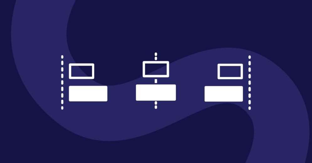
So let's imagine a simple example where you have several icons, and you want to align them horizontally with each other (think of the opposite axis) and add a block of explanatory text for each one.
You could align the icons by taking into account their edges on the left. However, icons often have different shapes and weights.
Therefore, the recommendation is to center align the icons and the left align your text blocks. See in the image below:

Aligning objects to the center creates a balance between them, establishing a sense of order and organization.
Objects are widely used in UI Design and often have different dimensions. Center alignment can soothe their differences.
Grid alignment
Grids can be a great tool to simplify and control the process of UI alignment. Nowadays, the majority of design tools have the option of layout grids (like Figma), which is amazing because they act as a guide.
Grids allow keeping your designs consistent while ensuring the proportion of elements. You can apply a layout grid to any component.

With the numerous layout tools available today, you can successfully align your projects.
Reading tip: Typography in UI: How To Enhance User Experience


.svg)