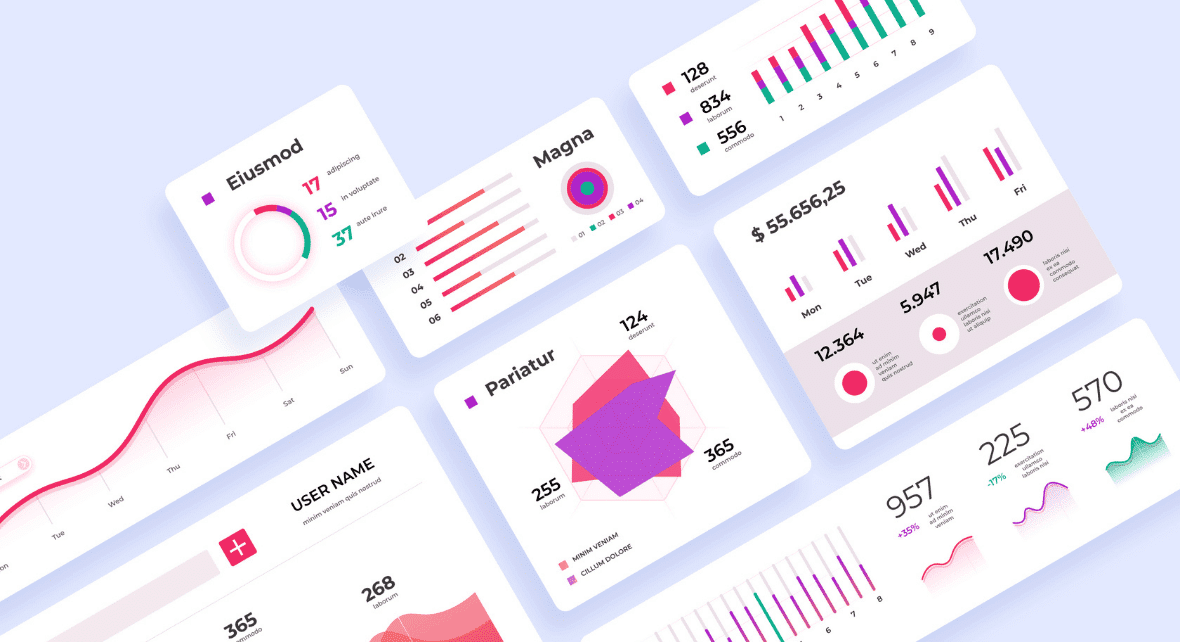

Dashboards offer a powerful way to transform complex numbers into engaging visuals. But why is it important?
In today's tech-savvy world, where information travels globally, we have endless possibilities at our fingertips. As we become more connected and rely on various software and electronic devices, the amount of available data keeps growing.
By 2025, it's estimated that the world's data will reach an impressive 163 trillion gigabytes. Wrap your head around that! It's a challenge for us to grasp such immense quantities.
And that's where Data Visualization Design comes in. It's all about presenting data in a way that's easy to understand and enjoyable. Designers play a vital role in creating user-friendly data representations, helping us navigate and make sense of information effortlessly. Keep reading to know more!
What Is a Dashboard?
Imagine having a screen that provides you with instant access to organized and crucial information about an app, software, or even the progress of your business. That's exactly what a dashboard is all about.
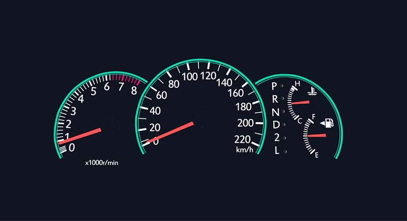
In simple terms, a dashboard serves as a centralized hub, offering relevant and easily digestible data to its users. It's like the dashboard in a car, where you find the key information that enables the driver to keep moving smoothly:
- Speedometer
- Fuel gauge
- Navigation directions
With this information, the driver is able to make the decisions that allow them to continue driving without any problems.
Similarly, a well-designed dashboard should present only the most pertinent information tailored to its user's needs. It's all about keeping things clear, simple, and engaging.
A dashboard should bring information to the user in a simple and organized manner – usually graphically – so that they can make important decisions on any subject.
Therefore, one of the primary goals of dashboards is to reduce the user's cognitive load by presenting only the most relevant information, thereby saving the user time and increasing their efficiency in completing tasks.
Let's dive deeper into the world of dashboards and explore how they can revolutionize your app, software, or business.
Reading Tip: Multiple Perspective Problem Framing: Improving The Innovation Process
Key Features of a Dashboard
Creating a dashboard involves more than just summarizing key information for the user. It should encompass a set of fundamental features that ensure its effectiveness.
Some of these essential elements include:
1) Support the user's goals
The dashboard needs to be aligned with the user's objectives and provide essential information to support their decision-making.
In this sense, the dashboard must highlight the most relevant information to the user and capture their attention.
Furthermore, dashboards should provide rapid availability of information, clarity in presentation, and a focus on delivering a superior user experience.
2) Uncover Hidden Insights
A dashboard should not only present explicit data but also offer valuable insights related to the user's analysis. To achieve this, it's crucial to utilize titles, charts, clusters, and other visual elements that assist users in interpreting the data and information effectively.
Now, imagine you're analyzing sales data on a dashboard for your e-commerce business. Alongside the explicit sales figures, the dashboard might highlight trends in customer preferences, showing which products are gaining popularity. This information can help you identify new opportunities and make informed decisions for future product offerings.
A well-designed dashboard can go beyond the present data and provide glimpses into future trends. By visualizing predictions or forecasts, you have other possibilities for interpretation and valuable insights into potential market shifts or customer behavior.
In summary, a great dashboard helps uncover hidden insights, empowering users to make informed decisions and stay one step ahead.
3) Show summaries, but allow for in-depth exploration
Ok, so we already know that when we open a dashboard, we must see only essential data. However, we should also have the ability to explore further.
A well-designed dashboard provides an interactive interface that allows users to drill down from overviews to more detailed views. This empowers users to uncover deeper insights and explore specific areas of interest.
For example, if you're using a financial dashboard for tracking your expenses, you quickly see an overview of your spending categories, like groceries, transportation, and entertainment. This summary provides a clear snapshot of your expenses at a glance.
But you must be able to click on a particular spending category, such as groceries, to delve into more detailed information like individual transactions or monthly trends.
4) Maximize the Use of Space
Great dashboards are designed to fit within a single screen, providing a seamless viewing experience. To achieve this, it's crucial to optimize the available space where the dashboard will be created.
Streamline the design by removing unnecessary elements such as images, icons, and symbols. This ensures that the user's attention remains focused and the dashboard becomes more efficient and visually appealing.
Think of it like tidying up a cluttered workspace, creating a clean and organized environment for users to navigate effortlessly.
By maximizing the use of space, your dashboard becomes a powerful tool that presents information clearly and concisely, enhancing usability and user satisfaction!
Reading Tip: Usability Test: How To Prepare And Conduct One?
Dashboard Types
The 3 most common dashboard types are:
- Operational;
- Analytical;
- Strategic.
Each one of them has specific characteristics and different objectives. Let's understand each of them a little more in-depth.
Operational Dashboards
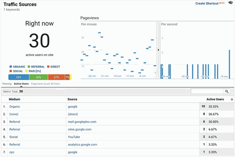
This type of dashboard is used to inform the user of the current status of some action.
For example, in the case of a website, an operational dashboard will tell you the number of active visitors, number of views per minute, shares, etc.
In this way, the user has a status of what is happening in real-time.
Analytical Dashboards
People use analytical dashboards to display information and compare performance over a given period.
Unlike the operational dashboard, this type provides more in-depth information and compares it to last month's results, for example.
This type of dashboard is often found in companies looking to monitor their profit or loss on a rolling basis, month by month, quarter by quarter.
One of the central points of the analytical dashboard is to enable the user to identify problems and trends.
Strategic Dashboards
Strategic dashboards provide a view of key performance indicators (KPIs) to monitor user goals and objectives.
In this sense, the strategic dashboard does not bring the operational information of the day-to-day, it is a simpler tool where it is only possible to evaluate whether or not the goals have been achieved.
Reading Tip: Business Design: Why Is it Important to Know About Business?
How to Create a Dashboard: Tips and Best Practices
The dashboard concept is relatively simple: a screen with concise and relevant information for the user.
However, we know that in many cases, applying the theory in practice is a lot more complicated than it sounds.
We've compiled a set of valuable tips and best practices to help you create an efficient dashboard!
Remember, training and practice play a pivotal role in interface development. So make it a habit to practice whenever you get the chance. The more you practice, the better you'll become at designing effective and user-friendly dashboards.
1) Define the goal and purpose of the dashboard
It is crucial to define the goals and purpose of the dashboard clearly.
Knowing the reasons why the dashboard will be used makes it easier to determine what information, charts, insights, and level of detail are necessary to develop the dashboard.
Understanding its purpose also helps select which type of dashboard will be most convenient for the user: operational, analytical, or strategic.
2) Conduct a user survey
Understanding your users' unique needs and goals is the key to creating a successful dashboard. Think of the dashboard as a product that caters to their specific requirements.
To accomplish this, you should always conduct a user survey. Proper research helps you gain insights into who your users are, their expectations, desires, wishes, and goals.
For instance, in a company's dashboard designed to track results, different departments will access the same dashboard but analyze different data and information.
By understanding your users' diverse perspectives, you can tailor the dashboard to meet their specific needs. Identify the main relevant information and the data that is common to all users. With this knowledge, you can create customized views of the same dashboard that cater to different user groups.
This user-centric approach ensures your dashboard becomes a valuable tool, providing relevant insights and empowering users across the organization.
Reading Tip: Persona: Why Is It Essential for Any UX Design Project?
3) Choosing the best way to represent data
Developing a captivating dashboard involves harnessing the power of visual representations that will help interpretation and analysis. Without engaging graphs or visual elements, you're left with a mere database, not a dynamic dashboard.
When creating your dashboard, choosing the right graphics that effectively convey specific analyses and information to your users is vital. Once again, understanding your users and their goals is key to accomplishing this.
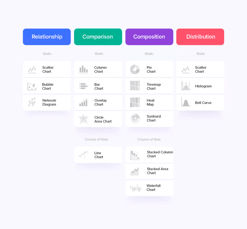
Let's explore the chart types that can breathe life into your data:
- Scatter or bubble charts reveal relationships between data and information.
- Column, bar, or line charts facilitate easy comparisons.
- Pie charts, heat maps, and area charts provide a snapshot of representativeness within a whole.
- Histograms and scatter charts help visualize data distribution.
By employing these visually engaging chart types, you transform raw data into meaningful insights that captivate and inform your users.
Remember, understanding your audience and their objectives is fundamental to designing a dashboard that truly shines.
To help you choose the best visual/graphical element, you can ask yourself a few questions, such as:
- How many variables need to be covered in each chart?
- Does it make sense to show the evolution of the data or its distribution?
- Do the insights created by this chart help the user?
- Does this chart make the information clear or is there some bias that needs to be clarified?
4) Stick to the norm and stay consistent
Dashboards are interfaces like any other. Therefore, it is important to remember some UI rules to develop better interfaces.
In this regard, remember to standardize and be consistent with your dashboard.
Be mindful of names, functions, colors, and visuals. Keep everything consistent and standardized across the dashboard to prevent user confusion and misinterpretation.
Therefore, create simplified frameworks and style guides, for example. These details make all the difference at the moment of user interaction.
Reading Tip: Colors in UI: An Essential Guide to Use in Your Projects
5) Establish the hierarchy of elements and information
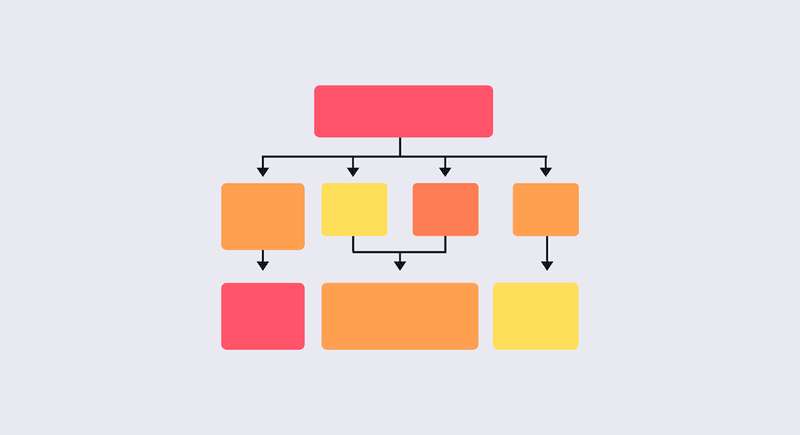
Dashboards should make the most relevant information available quickly and easily to users.
Therefore, it is essential to establish the hierarchy of information and visual elements of the dashboard you are developing.
Information hierarchy means prioritizing and making available the most relevant information in the foreground and the rest in the background.
In addition, it is important to determine an information flow for the user. In this sense, you can use tools such as Storytelling to make the information available in the best way for the user to understand.
Progressive Disclosure
Another technique that can be used to improve the hierarchy of information in your dashboard is Progressive Disclosure.
This technique consists of reducing the clutter of too much information on the same chart and prioritizes the user's attention to the most relevant data.
An example of Progressive Disclosure is the pop-up of more detailed information when we put the mouse down at a certain point on a chart.

This approach allows the user to gain additional insights into specific data points without overwhelming them by clustering all the information together.
6) Use grids
Don't underestimate the value of grids. Imagine your dashboard as a collection of content building blocks. Grids will help you align and plan elements effectively, ensuring a visually pleasing and efficient interface for your users.
Grids offer numerous benefits:
- Alignment: grids enable you to align information seamlessly, creating a cohesive and organized layout that enhances readability.
- Visual Comfort: it provides a visually comfortable experience, as elements are thoughtfully placed and balanced.
- Efficiency: it streamlines the design process, allowing for consistent spacing between elements.
Remember to leverage negative spaces—the blank areas between dashboard elements. Well-utilized negative spaces and proper margins contribute to a fatigue-free reading experience, ensuring your content remains clear and uncluttered.
Reading Tip: Creating Responsive Design With Grids
7) Be careful with the amount of information and interactions
One of the greatest challenges of dashboard development is the prioritization of information.
At first, it may seem that all information and data are important, and we can make the mistake of creating a dashboard that is too large.
The problem with a large dashboard is that it does not hold the user's attention and can make their experience very tiresome and inefficient.
It is important to understand very well who your users are and what their needs are in order to understand what information is really important to them.
However, the opposite can also be detrimental. Creating a very succinct dashboard that relies on a lot of user interaction is also inappropriate.
Remember that we humans, in general, have difficulty working with many things at once. Therefore, creating too many interactions to get at one piece of information can make the user experience less than optimal.
8) Consider other UX/UI Design principles
Within this list of tips, we have already listed some UX/UI Design principles for you to consider when developing dashboards.
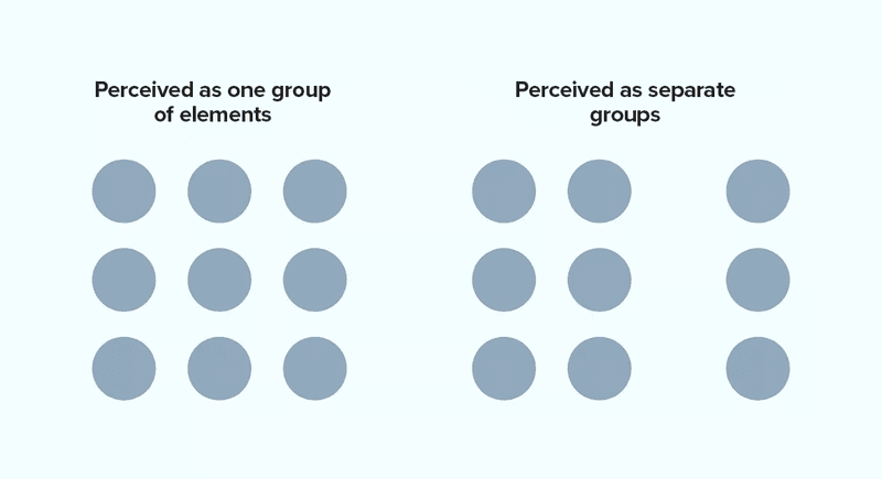
There are also Gestalt principles that can be very helpful in making your dashboard easier to interpret:
- Proximity: elements that are close to each other have a direct relationship;
- Similarity: similar elements tend to appear to be in the same group;
- Closure: create groups in a closed fashion to create implicit boundaries;
- Continuity: when elements are aligned or organized in any way they create the interpretation of being related.
In addition to these, you can also use the Laws of UX, which are also principles for developing better interfaces based on user behavior.
9) Provide insights and don't just throw the information around
A common mistake in dashboard development is to focus on creating a visually appealing display of data without considering the insights that the data can provide.
It is crucial to understand the impact of the data being incorporated into the dashboard and, through alignment and user research, determine what conclusions or directions this information can offer.
A dashboard should not just be a pretty way of looking at data. It should be useful for users to make more assertive decisions about the business or for their next actions.
Always keep in mind two questions that can help you bring insights from the data:
- Why did this happen?
- How does this impact the user?
10) Use appropriate colors
It's not just about aesthetics; the right color choices enhance the interpretation of information in your dashboard graphics.
When utilizing colors, opt for patterns that are easily identifiable and promote user interaction with the interface. Steer clear of unusual color schemes or shades that are too closely positioned on the color circle.
Consider this: Imagine a sales dashboard where green signifies positive growth and red indicates a decline. Using intuitive color associations like this helps users quickly grasp the meaning behind the data without extensive analysis.
By employing suitable color combinations, you ensure a visually appealing dashboard that supports seamless data interpretation and fosters an engaging user experience.
Reading Tip: Color management: Keeping Your Colors Consistent
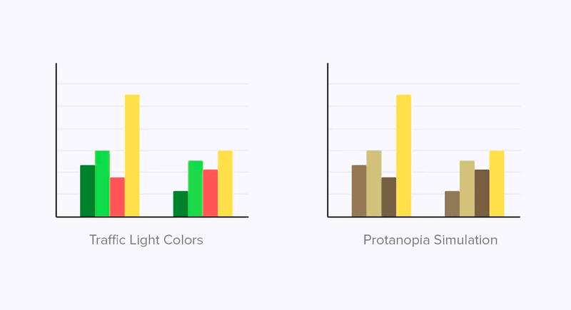
11) Consider accessibility
It is important to develop your dashboard with accessibility in mind. For example, when selecting a color scheme, it is crucial to consider individuals with color blindness.
To accommodate this visual impairment, consider using colors that are easily distinguishable for them or create a specific version of the dashboard.
In addition, it is crucial to consider various types of accessibility for different disabilities, including:
- Hearing;
- Motor;
- Visual;
- Cognitive.
If you would like to know more about inclusive design, check the article: Accessibility For Digital Products
12) Save the best for last: developing the dashboard
To maximize your dashboard's impact, save it for the final stage of development. By doing so, you'll have all the necessary information and insights to create a powerful and tailored dashboard. Here's why:
- Minimize rework: building the dashboard last prevents unnecessary adjustments that may arise from developing other parts of your project.
- Streamline development: by focusing on other components first, you simplify the overall development process, ensuring smoother progress.
- Design with purpose: waiting until the end allows you to align the dashboard with your project's goals, providing a clear and concise overview of your data.
Remember, the dashboard remains a critical feature of your interface, so approach its design thoughtfully. By developing it last, you can optimize its effectiveness.