Don Norman, the father of usability and co-founder of the Nielsen Norman Group, stresses the importance of thinking about people and the interaction they will have with the products and systems being developed.
This is why areas such as UX Design are so important within a company. To ensure that the experiences of the end users – and anyone else who interacts with the product – are the best they can be.
But how do you ensure that all these users have a great experience with your design?
With this in mind, Norman wrote – based on the concept of User-Centered Design – 6 fundamental principles of Interaction Design. Check each one out below.
1) Visibility
The principle of visibility brings the matter of discovery.
The user discovers the interface functions by the simple fact that they are visible for interaction. In other words, the more visible a function is, the more the users will notice and use it.
In this regard, visible buttons and menus make the user's journey easier. Whereas if these functions are not visible, they will not be used.
Regarding visibility, it's important to pay attention to the prioritization of functions.
It's not recommended to put buttons and menus for all the functionalities of a system. The screen becomes cluttered and there is no distinction between the most important functions.
The big challenge is to understand how to prioritize content and functions.
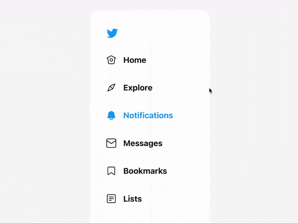
A classic example of visibility and interaction is the Hamburger icon. It represents the function menu on many websites. It's so common that the user already understands that this icon represents a deep dive of the tasks.
Another example of visibility is the button for writing e-mails in the Gmail inbox. With this feature, the user finds the function almost instinctively.

Reading Tip: Usability: How To Develop A User-Friendly Website
2) Feedback
Feedback is the response that the user should receive after performing some action on the interface.
For every interaction with a product, it is natural to create the expectation of a response. Be it confirming the success or failure of the action. If this doesn't happen, the user may have doubts and their experience may be impacted.
A very simple and everyday example is the simple click of a button. If there is no feedback ensuring that the button was clicked, the user will keep on clicking.
We can classify feedback into two categories:
Activation Feedback: when the response to an action is sensorial, such as a visual or sound effect. For example: when you click on a button, it changes color or emits a sound, confirming that it has been activated.
- Behavioral Feedback: when the response indicates that the action had some effect within the system. For example: when you click on a button to finalize your online purchase, a message appears confirming that your action was successfully performed.
3) Constraints
To avoid any invalid or incorrect action by the user, a system must have constraints.
Constraints, within Interaction Design, can be both physical and behavioral.
Physical constraints can be exemplified by the cell phone screen itself. There is no way to have interaction outside of it.
The behavioral constraints, on the other hand, are more related to the user experience and what actions they can or cannot perform within the interface.
An interesting example is the action buttons in any computer program. When an action is restricted to the user, the button usually appears gray and opaque, making it clear that the function is not available at that moment.
This kind of restriction is also common on online forms, where the "submit" button is inactive until the entire form is filled out correctly.

A lack of restrictions can cause confusion and frustration for the users, causing them to click incorrectly on inactive buttons, or submit a form with incomplete information.
Reading Tip: Design System – How To Create One?
4) Mapping
It is clear that any icon, button, or control, when activated, will trigger some function within the system.
But in addition to this, it is important to have a connection between the design and the function linked to it. This connection, within Interaction Design, is called Mapping.
This way, the more the users assimilate the controls with their perception of reality, the better the interaction and the experience.
For example, the volume button shows longer bars as the volume increases and shorter bars as the volume decreases.

Although mapping may seem straightforward, it requires careful attention and testing with real users.
One useful way to assess the accuracy of mapping is to examine the design of a control and consider the user's expectation for it.
For instance, if a control indicates a gradual increase or decrease, the symbols "+" and "-" may be used. Similarly, if the control is used to start a video, the user would likely expect a button with a triangle symbolizing play
5) Consistency
One of the ways to improve the user experience and ensure a fast learning curve is to use patterns.
Creating patterns helps the user assimilate your system better, making navigation simpler and easier.
Consistency, in interaction design, is nothing more than creating these patterns within the system. Representing controls with similar functions in a similar way, positioning buttons in the same place and in the same way, using the same colors, etc.
A lack of consistency can cause delays in action and confusion for the user. The idea is always to have the user assimilate every function of your system, without having to worry about exceptions.
In addition, it's important to understand if there is consistency with other similar systems.
For example, if on all websites writing and reading are done from left to right, it is not recommended that your website does it any other way. The case is exaggerated, but it helps to understand. Doing something differently is fine if it doesn't interfere with the way the user is used to doing it in other systems.

Reading Tip: A Brief Story About Usability
6) Affordance and Signifiers
Affordances
The concept of affordance is connected to the attributes that an object has and that makes a certain interaction possible.
For example, a glass window has attributes that enable us to see through it. Its hinges have attributes that enable it to open in a particular direction, and the opening of the window enables air to flow through it. These are all examples of affordances – the potential interaction relations between the user and the system.
Signifiers
Signifiers are the signs that show that a connection exists and how to use it. They are the visual attributes that indicate how something works.
In the window example, the design of the handle indicates which way it opens, or the shape of the hinges can clearly show whether the window should be pulled or pushed (or both).
Affordances and signifiers are concepts in Interaction Design that go together and are commonly mistaken.
Remember that affordances are the attributes that make interaction possible, while signifiers are the signals that make it possible to identify these attributes and use them.
Everyday examples
It is not uncommon to find, on websites, buttons designed in three-dimensional form. This 3D view indicates that the button must be pressed to perform some function. The 3D is a signifier demonstrating an affordance (click).
Hyperlinks are a common type of signifier in web design. When a word has a link and is clickable, it is typically underlined and blue, indicating its clickability.

Affordances and signifiers are crucial in indicating that an object is interactable. However, if these principles are not properly signified and aligned with other design principles (such as Visibility, Constraints, Mappings, etc.), the functions become difficult to use, leading to a poor user experience.
By using all 6 principles correctly, we can ensure an Interaction Design that allows a good user experience.
It's important to remember that these concepts aim to provide a simplified and easy user journey, learning, and remembering so that the use of the system flows as automatically as possible.